How to Choose Paint Colors for Every Room in Your Home
Choose paint colors by lighting, room size, and mood for a smooth home-wide palette.
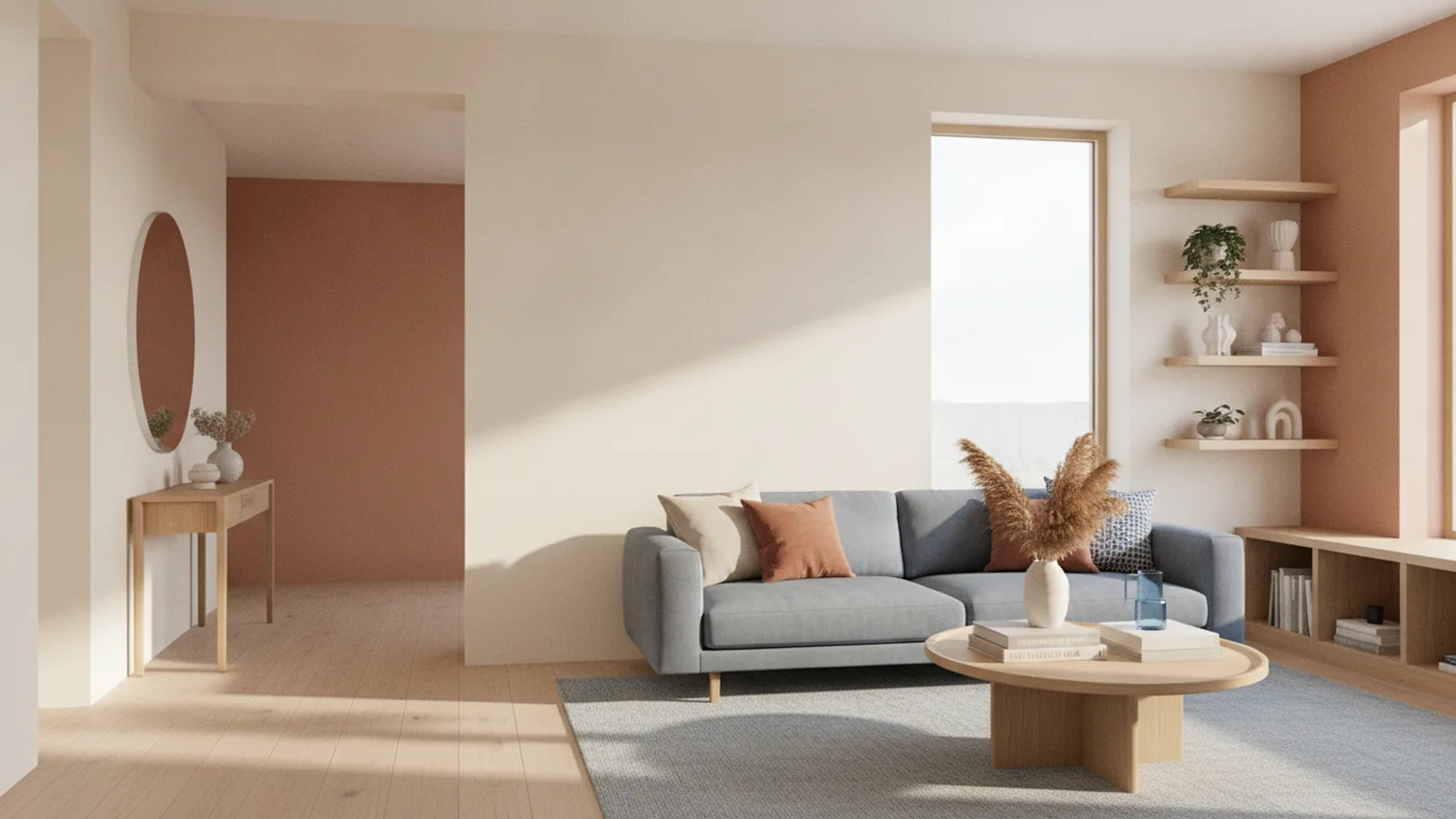
Start with a simple rule for choosing the right paint color
To choose a color to paint a room, match three things: the room’s purpose, the light you actually get, and the colors you already own. If you do that first, the final shade is usually obvious. Furniture and decor set the “do not break” parts of your palette.
Begin by picking a primary direction, like warm neutrals or cool grays. Then test multiple paint samples from that direction in your space. This approach works whether you are starting fresh or updating what you already have.
You will also avoid a common mistake. Many people choose a color from a showroom chip under bright lighting. Your home light will change that color by morning, evening, and season.

Find real inspiration sources for your color palette
Inspiration sources for color should connect to your life, not just a mood board. Start with the materials you cannot easily swap. Look at the undertones in wood floors, cabinets, or a favorite rug.
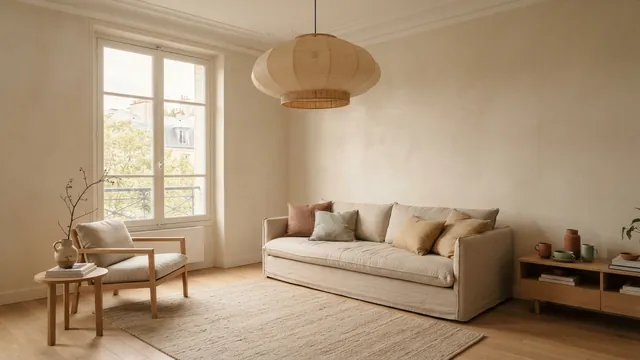
Next, pull two to four “anchor” colors from existing decor. For example, a sofa might be a warm gray. The throw pillows might add a muted olive. Your curtains might bring a soft cream.
When you gather inspiration, focus on undertones. Paint colors with the same name can shift between warm and cool. Aim for a palette where those undertones agree across rooms.
- Hard anchors: flooring, cabinets, stone, and large upholstered items
- Soft anchors: rugs, curtains, bedding, and artwork
- Accent anchors: metal finishes, ceramics, and patterned decor
If you want a shortcut, choose one room’s anchor color first. Then build its neighbors around that anchor. This makes color flow between rooms feel planned, not random.
Account for room size effects before you commit
Room size effects are real, and color is one of the biggest drivers. In general, lighter colors reflect more light. That can make a small space appear larger and more open.
For small rooms, pick a lighter shade than you think you need. Stay within a single paint family to keep the look cohesive. For example, a soft cream reads brighter than a strong beige.
In larger rooms, darker colors can feel grounded. They create an intimate feel when the walls wrap around the space. The key is to pick a dark that matches your room’s light level.
- Pick 1–2 light options for small rooms
- Pick 1–2 deeper options for larger rooms
- Test each option on the wall, not just a sample card
Also consider ceiling height. A low ceiling can feel even lower with a very dark color. If you love the look, try a darker wall with a lighter ceiling for balance.
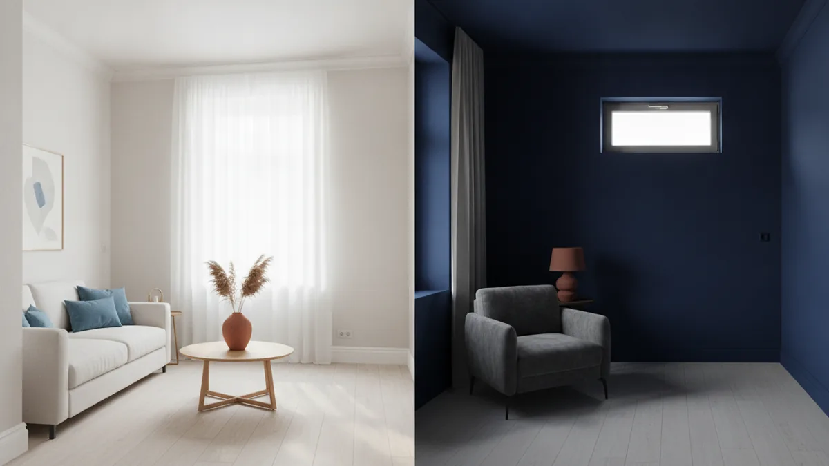
Use lighting impact on colors to avoid shade surprises
Lighting impact on colors is the reason paint samples are non-negotiable. Daylight, bulbs, and reflections all shift how pigments appear. A color that looks crisp at noon can look dull at night.
Start by checking your lighting types. Note the bulb temperature on your fixtures. Many homes use “warm” bulbs in the 2700K range, which pushes paint toward warmer tones. Cooler bulbs near 4000K can make warm paint feel more muted.
Then watch how light hits the wall across the day. North-facing rooms often feel cooler and can bring out gray notes. South-facing rooms tend to glow and can make warm undertones stronger.
| Room light pattern | What you may notice in paint | Practical adjustment |
|---|---|---|
| North-facing, steady cool light | Colors can look a bit grayer | Choose a slightly warmer undertone |
| South-facing, bright daylight | Colors can look more saturated | Test for comfort at midday |
| Low light, mostly evening use | Colors can go flat or dark | Pick a value that still feels bright |
To evaluate how a color will actually behave, test in two lighting moments. View your samples in daylight and at night with your real bulbs. Take photos each time so you can compare later.
Create flow between rooms with a consistent palette
Color flow between rooms is about harmony, not matching every wall. When rooms connect through hallways or open doorways, your eyes experience them in the same viewing session. If two rooms clash in undertone, the transition feels abrupt.
A helpful method is to choose one “base” value for most shared areas. Then vary the saturation or depth by room purpose. For example, use a warm neutral in the hallway and living spaces. Choose a bedroom shade that is slightly deeper or softer within that same undertone.
To build flow, keep undertones consistent. Warm undertones often include hints of cream, beige, or earthy tones. Cool undertones often include hints of gray or blue. Avoid switching undertone directions room to room unless you plan a clear contrast.
- Pick a common neutral and reuse it in multiple rooms
- Vary value (lightness) based on room size and function
- Repeat an accent color in small doses across doors and hallways
Experiment with various shades from a chosen palette. If you love a particular color family, try three values: a lighter version for trim or ceilings, a mid-tone for main walls, and a deeper option for an accent wall. This keeps the palette tight while still adding interest.
Use color psychology to shape mood and function
Color psychology can guide your choices, but treat it as a direction, not a rule. People tend to associate softer, muted tones with calm. Brighter tones can feel energizing when used in the right places.
For how to choose a color for your bedroom, start with the feeling you want after a long day. Many bedrooms benefit from lower contrast and softer saturation. Choose bedding-friendly tones that help the room feel restful at night.
For example, if your bedroom includes warm wood or cream textiles, a warm off-white or soft beige can feel soothing. If your decor already leans cool, a gentle gray with a blue-green undertone may feel cleaner and calmer.
For a living room, think about how you use the space. If it is where you read, host, or watch TV, you want a background that feels flexible. A how to choose color palette for living room approach often starts with a neutral base. Then add warmth or contrast through the accent walls and furnishings.
- Pick a base wall color you can live with daily
- Add depth with one darker wall or an accent color
- Balance warmth and coolness with fabrics and decor
Also remember that colors affect how a room functions. Dark shades can reduce perceived brightness, which may matter for reading corners. Very light shades can feel stark if the room lacks texture or warmth.
Conclusion and final tips for confident paint color decisions
To choose the right paint color, build your decision on your real environment. Use inspiration sources from your furniture and decor. Respect room size effects by leaning lighter in small spaces and deeper in larger ones. This alone will prevent many “why does this look wrong?” moments.
Then dial in lighting. Evaluate your paint at different times using your actual bulbs. A lighting check gives you confidence that your color will stay true through the day.
Finally, aim for harmonious flow between rooms. Reuse undertones, test variations from one palette, and let each room’s purpose guide the final depth. If you want a repeatable workflow, pick one anchor palette, test several values, and adjust until every connected room feels cohesive.
If you still feel unsure, return to the samples. Live with them on the wall for a few days. Your eyes adapt, and your comfort becomes clearer than any online swatch.
Frequently asked questions
- How do I choose a color to paint a room without getting it wrong?
- Match the paint to existing furniture and the light you actually have. Test 2 to 4 samples on your wall, then compare in daylight and evening.
- How to choose a color for your bedroom that feels calm?
- Look for softer, lower-contrast shades that work with your bedding and wood tones. View samples at night, because bedroom lighting changes everything.
- What’s the best way to choose a color palette for living room spaces?
- Start with a neutral base that fits your floors and major furnishings. Then vary value by wall depth and add accents through textiles and art.
- Do paint colors look different in different lighting?
- Yes. Daylight, bulb temperature, and room direction can shift undertones and saturation. Test your paint in both morning and evening light.
- How can I make paint colors flow between rooms?
- Keep undertones consistent across connected rooms and vary only the depth. Reuse one neutral base and repeat an accent color in small doses.
- Should I test paint samples on the whole wall?
- At least test on the actual wall area you plan to paint. Cover a section big enough to see the full effect from your usual viewing spot.
Related reading
Kitchen Renovation Costs — Price Ranges and Budget Factors
See typical kitchen remodel prices, key cost drivers, and ways to keep your budget on track.
Large Living Room Walls — Scale, Style, and Warmth
Use scale, art, texture, shelves, and light to make a large wall feel balanced.
High Ceilings — Warmth, Scale and Style
Use color, scale and soft textures to make tall rooms feel inviting.