How to Choose the Right Paint Color for a Cohesive Home
Pick paint colors with swatches, lighting tests, and a cohesive palette.
Finding inspiration that you can actually live with
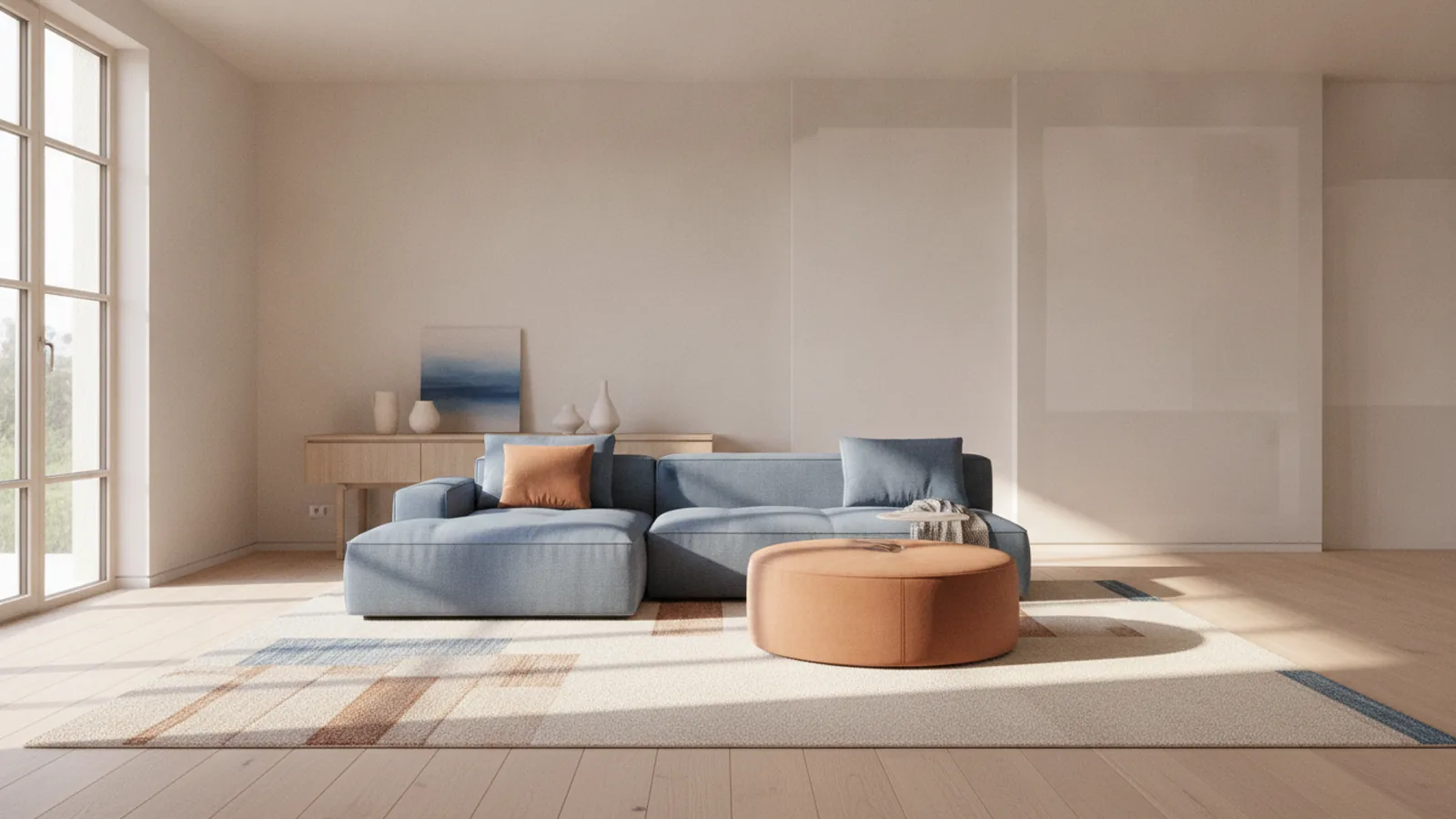
If you want a cohesive palette across your home, start with what already has color. That means fabrics, rugs, upholstered furniture, and artwork you love. Look at 3 to 5 dominant tones, not every color you notice at first glance. Pull those tones into your paint shortlist so the walls feel like part of the same story.
Try a simple “source-to-wall” rule. Choose one item as your anchor, then match two supporting colors from other pieces nearby. For example, a neutral sofa might include warm beige undertones, while nearby art can add a hint of blue-green. When you translate those colors to paint, you avoid fighting your existing space.
If you are stuck, browse a few rooms you already like in photos and note why they feel right. Then replicate the pattern in your home. Is the color palette mostly neutral with one warm accent? Or is it cool and airy with varied shades of the same hue? This is color theory in everyday form.
Use color swatches, not vibes
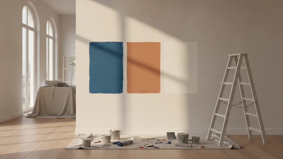
Color swatches are useful, but only if you treat them like test samples. Move them next to the items that matter: curtains, the most visible rug, and any large artwork. Stand back from the swatches from 6 to 10 feet. What looks pleasant up close can look washed out or harsh from a distance.
- Pick at least one light color option and one deeper option to compare.
- Choose paints with similar undertones across rooms, like warm beige or cool gray.
- Save a few sample labels so you can compare later.

Understanding room size and what walls do to space
Room dimensions change how paint reads. Lighter colors often make smaller rooms feel more open because they reflect more light. They also help your eye travel across walls without sharp contrast. If your room feels cramped or you want calmer sight lines, start with light neutrals or soft pastels.
For larger rooms, darker colors can reduce “emptiness.” A deep shade can create a boundary and make the room feel more grounded. In practice, this works especially well when you have high ceilings or long sight lines. The key is to choose a darker paint that still matches your home’s overall tone.
Be careful with high-contrast walls. A very light wall next to very dark trim can make a room feel choppy. Instead, keep contrast intentional. Use the same undertone family on walls and nearby architectural features, like trim, built-ins, and shelving.
Quick sizing guidance you can use today
Use these rules as starting points, then adjust with your lighting test. A good plan is to shortlist two shades per room: one “space-maker” and one “cozier” option. You can then pick based on how the room feels at different times.
- Small rooms: lean lighter to boost visual space.
- Large rooms: lean deeper to add warmth and closeness.
- Long rooms: vary light levels gently to avoid a corridor feel.
- Rooms with lots of sight lines: avoid extreme contrast between walls and trim.
Considering lighting effects and testing across the day
Light sources are the biggest reason paint samples disappoint. The same paint swatch can look different under daylight, morning sun, and warm evening lamps. That is why you should plan to test colors on actual wall sections. Paint swatches alone are not enough once you have real light bouncing off floors and furnishings.
Start by observing your room’s light for a full day. Note where sunlight hits, when it moves, and what lamps you use at night. Then test each candidate color on the wall with proper coverage. Use at least two coats if the brand needs it. Let the paint fully cure before you decide, because the final tone can shift as it dries.
Here is a practical method for how to choose the right paint color for a room. Tape sample cards on the wall first to see undertones from different angles. Then apply actual paint samples in a patch size of about 2 feet by 2 feet. Compare those patches at three times: morning, late afternoon, and evening with lamps on.
Use undertones to avoid surprises
Undertones control whether a color reads warm or cool. Warm colors often look more inviting but can feel too orange in cool lighting. Cool colors can feel fresh but can look flat if your bulbs are very warm. When you match undertones, your paint looks intentional instead of accidental.
- Pick your bulb temperature for evening testing if possible.
- Test against permanent surfaces like cabinetry and flooring.
- Re-check color when artwork and curtains are in place.
Creating cohesion across rooms with a shared color palette
To unify your home, build a cohesive design using a common color palette. Cohesion does not mean every room uses the same paint shade. It means related rooms share undertones and a few “bridge” colors that repeat naturally. This keeps transitions smooth as you walk through the home.
A reliable approach is to choose one dominant neutral for most walls, then vary accents by room. For example, you can pick neutral colors for ceilings and common areas, then shift into warm or cool variations by space. This is where color matching matters most with architectural features like trim and built-ins.
Think in terms of flow. If you can see into multiple rooms from one hallway, those walls must work together. Pick a main color family for those visible surfaces, then add depth with different values. Depth means lightness and darkness, not just “more color.”
How to structure your palette
Use this framework to avoid overthinking. First, select a base neutral. Second, pick an accent family you repeat in small ways. Third, choose one deeper shade for contrast in rooms that can handle it.
| Palette role | What it does | Where to use it |
|---|---|---|
| Base neutral | Creates flow between rooms | Hallways, ceilings, most walls |
| Supporting color | Adds character without conflict | Bedrooms, dining rooms, reading nooks |
| Accent tone | Guides attention and mood | Trim, furniture, artwork, one wall |
- Repeat at least one color in each room through textiles or décor.
- Keep trims within the same undertone family as wall colors.
- Use neutral colors to calm transitions when rooms differ.
Utilizing color psychology to shape the mood of each room
Color psychology is not magic, but it is a strong design tool. It influences how a space feels because humans often associate color with temperature and emotion. Cool colors often read calm and focused, while warm colors often feel cozy and social. Your goal is to pick a shade that supports your daily use of the room.
When people ask how to choose the right paint color for bedroom, they usually want rest. Bedrooms generally benefit from less contrast and softer saturation. That does not mean “boring.” It means avoiding intense, highly saturated tones on all walls. A muted version of your favorite hue can deliver personality without overstimulation.
Also consider how color theory works with light and finishes. Paint finishes matter: matte hides imperfections and reduces glare, while eggshell and satin reflect more light. A satin finish can make light sources look brighter, which changes the mood at night. Match finish to the room’s lighting and your tolerance for shine.
Pair mood with practical choices
- For calm: choose cooler tones or muted versions of your hue.
- For energy: use warmer accents, not all-wall saturation.
- For focus: keep colors consistent with the room’s lighting level.
- For comfort: prioritize neutrals with warm undertones if bulbs run warm.
Choosing colors for specific rooms, starting with bedrooms
When you pick the right paint color for bedroom, start with the room’s features. Look at your bed frame, headboard fabric, and the dominant bedding tones. If your permanent surfaces include wood cabinets or warm flooring, pull undertones from those. That is how you avoid a bedroom that looks “almost right” but feels off every day.
Here are actionable bedroom options using the same home palette strategy. If your bedroom is small or has limited natural light, use a lighter neutral or a soft warm color. It will brighten the room and make it feel less crowded. If your bedroom is large with strong daylight, a deeper neutral or muted color can add comfort. It can also help you control the room’s visual noise.
Test bedroom paint with your typical evening routine in mind. Turn on the lamps you actually use, then check how the color looks at eye level. If your bulbs are warm, cool grays can tilt green or feel damp. If your bulbs are cool, warm beiges can start looking yellow. Use those signals to choose undertones, not just “favorite shade names.”
Bedroom selection workflow (repeatable)
- Collect color swatches from your bedding and nearby décor.
- Choose a base neutral that matches cabinetry and flooring undertones.
- Pick one deeper option for an accent wall or headboard zone.
- Apply sample paint patches and evaluate morning and evening.
- Confirm your chosen finish with how much glare you want.
Finally, connect the bedroom back to the rest of your home. If the bedroom door opens to a hallway, your wall color must flow with that shared base neutral. A cohesive design makes the whole home feel designed, not decorated room by room.
Use a color palette that respects both your taste and your architectural features. Your best choice is the one that looks stable under your light sources. Stable colors make everyday life feel simpler.
FAQ: Common questions about choosing paint color
How to choose the right paint color for a room?
Start with existing furnishings or art, then build a small palette from those tones. Test paint colors on the wall and compare them in morning and evening light. Match undertones to permanent surfaces to avoid surprises.
How to choose the right paint color for bedroom?
Use your bedding and headboard colors as the anchor. Pick softer neutrals or muted hues to keep the room calming. Test under your bedroom lamps so the color supports rest at night.
How to pick the right paint color for a bedroom if the room has little natural light?
Choose lighter colors to reflect more light and reduce the “shadowy” feel. Prefer neutrals with warm undertones if your lamps are warm. Test swatches on the wall, because cool tones can look dull in low light.
Do I need different paint colors in every room?
No. Cohesion usually comes from one shared base color palette with variations in value and saturation. You can create interest by changing the depth or finish, not by changing everything at once.
Why do paint swatches look different from the final paint?
Swatches are small and do not reflect the full range of light in your room. Paint also changes as it dries and as it coats the wall surface. Testing patches solves both issues.
Frequently asked questions
- How to choose the right paint color for a room?
- Start with colors already in your space, like art or textiles. Test paint on the wall across the day, then match undertones to floors and cabinetry.
- How to choose the right paint color for bedroom?
- Use your bedding and headboard as the anchor, then pick a softer neutral or muted hue. Test it with your actual lamps on at night.
- How to pick the right paint color for a bedroom with low natural light?
- Choose lighter colors to keep the room bright. Prefer warm-leaning neutrals if your lighting is warm, and verify with wall samples.
- What helps rooms feel cohesive in a home?
- A common color palette across spaces is the biggest driver. Use the same undertone family and repeat at least one supporting tone in décor.
- Do paint finishes change how color looks?
- Yes. Matte reduces glare and can read softer, while eggshell or satin reflect more light and can shift the tone at night.
- How do darker colors affect a large room?
- Darker colors often make large spaces feel cozier by giving the walls more visual weight. Balance them with lighting so they do not feel heavy.
Related reading
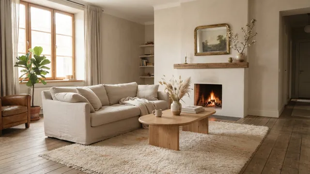
Couch Placement—Flow, Focus and Comfort
Place your couch to frame a focal point, keep paths clear, and make the room feel balanced.
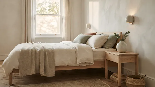
Master Bedroom — Color, Comfort and Personal Style
Build a calm, personal bedroom with smart choices and a budget that works.
Room Painting Labor Costs — Rates and Budget Factors
See typical room-painting labor rates and learn what drives the final price.