Cream Kitchen Cabinets: What Colour Walls Complement Them
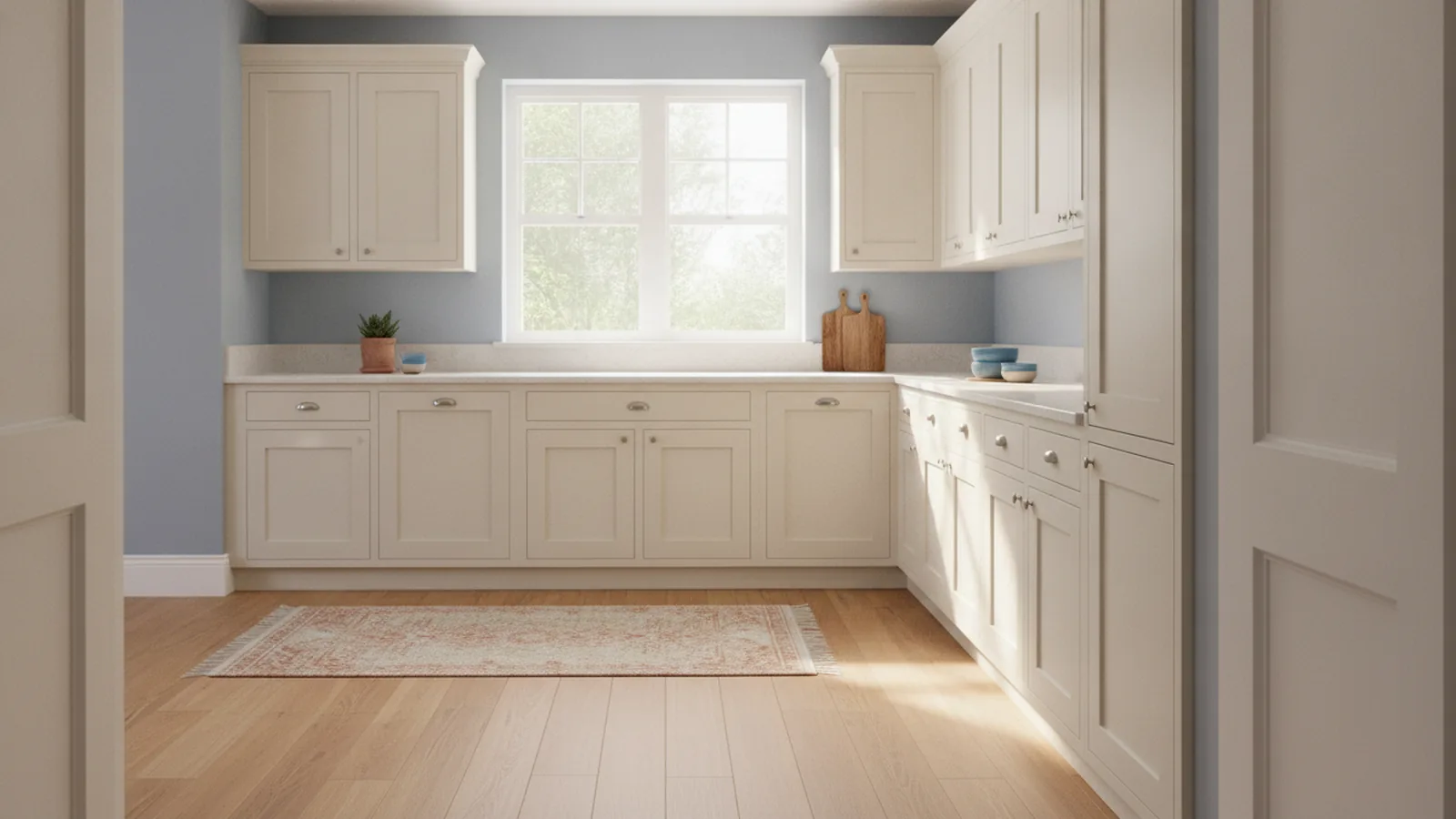
Best wall colors for cream cabinets: soft blues, warm neutrals, sage green.
Understanding cream kitchen cabinets
If you are choosing cream kitchen cabinets what colour walls, start with this simple idea: cream is warm and flexible. It sits between white and beige, so it can take on many looks. You can push the kitchen brighter with crisp whites. Or you can make it cozier with warm earth tones.
Cream cabinets also reflect light gently. That matters in kitchen aesthetics because kitchens often feel darker than other rooms. With the right wall color, cream cabinets can look lighter and more “finished.” With the wrong wall color, the kitchen can feel flat or slightly yellow.
Think about your existing elements too. Flooring, backsplash tile, and countertop finishes all influence the wall choice. If you already have a strong countertop color, the wall should support it. Then the whole kitchen reads as one color palette, not separate parts.
- Warm cream pairs well with warm neutrals and soft greens.
- Cool wall colors can brighten the space without fighting cream.
- Keep an eye on undertones, not just the cabinet shade name.
Color theory basics for kitchen wall choices
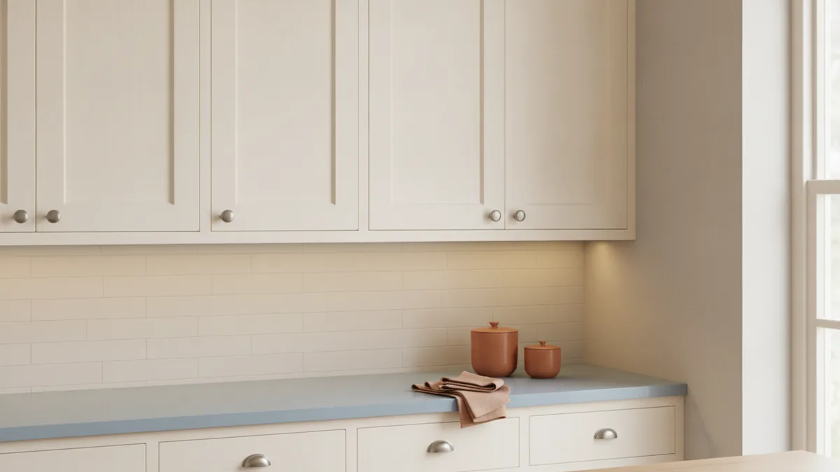
Kitchen cabinets and walls create a large “color field.” Because of that, color theory is practical here, not academic. Use harmony when you want a calm look. Use contrast when you want a more styled, high-impact look.
Start by checking undertones. Cream can be more buttery or more milky. Yellow-leaning cream warms the room. Blue-leaning cream looks more crisp. Your wall color should either match the undertone or intentionally contrast it.
Next, set a target mood. Soft moods come from low-contrast colors with similar light levels. Energetic moods come from clear differences in light and hue. In a kitchen, even small shifts can change how clean and open it feels.
| Goal | What to do | Example wall direction |
|---|---|---|
| Light and airy | Choose lighter walls with gentle hue | Soft blue or bright white |
| Warm and inviting | Match warm undertones with neutral paint | Beige or taupe |
| Fresh and natural | Add green with a muted tone | Sage or muted sage |
| More definition | Use contrast with cooler or darker shades | Darker grey or charcoal-adjacent |
Best wall colors for cream cabinets
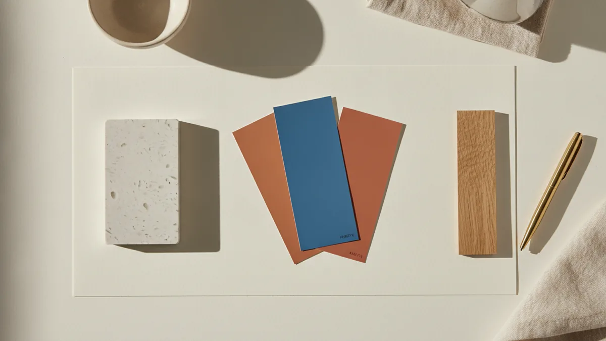
Now to the part you came for. Cream cabinets pair well with many wall colors, and that is the biggest advantage. You can build a design that feels timeless, not trendy. Below are the most reliable wall colors, with guidance for how they tend to look.
Soft shades of blue are a top choice when you want the kitchen to feel calming and light. Blue cools warm undertones, so cream cabinets do not look overly yellow. Look for pale or muted blues, not strong navy tones. In most kitchens, these create a gentle, airy “coastal” or “clean classic” feel.
Beige and taupe offer warm, organic backgrounds. They help cream cabinets look built-in and cohesive. Taupe often adds a slightly more modern edge than beige. If your countertops have warm veining or natural stone tones, beige and taupe walls can tie everything together.
Greens, especially sage bring a natural freshness. Sage is usually muted enough to stay elegant. It also sits nicely beside neutral colors and wood accents. If you want a calm kitchen style with personality, sage is one of the safest ways to add color without overwhelming the room.
Light grey kitchen cabinets what colour walls is a related question people ask when they mix cabinet tones. For cream cabinets, light grey walls are also a subtle partner. Light grey creates a clean backdrop that lets cream stay the star. If you want more contrast, use a medium or darker grey wall, but test it in daylight first.
White walls create a bright, clean look. This works especially well for smaller kitchens where you want light to bounce. The key is choosing a white that does not look bluish or dingy next to cream. If you use true white, it should feel intentional, not like “paper” next to warmer cabinets.
- Soft blue: airy feel, cools warm cream undertones.
- Beige/taupe: warm neutrality, cohesive and timeless.
- Sage: natural freshness with a calm kitchen style.
- Light grey: subtle contrast, clean and modern.
- White: bright backdrop for small kitchens.
Contrast vs. harmony: getting kitchen aesthetics right
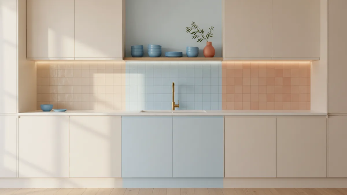
Choosing a wall color is not only about what looks good. It is about how the kitchen reads as one space. Harmony keeps things soft and blended. Contrast adds depth and definition.
Harmony usually comes from using similar light levels. If your cream cabinets are light and bright, walls that are also light will keep the room open. You will often see this with white, off-white, and pale blues. The cabinet and wall feel like they belong together, and details like hardware stand out gently.
Contrast usually comes from shifting either hue or darkness. Darker greys can make cream cabinets feel more crisp and tailored. Cooler tones can also add separation. However, contrast can go wrong if it becomes too heavy for the room. In low-light kitchens, darker walls can make the whole space feel smaller.
There is also a practical “countertop check.” Many people ask ivory kitchen cabinets what colour countertop when planning the full palette. While the countertop choice is separate from paint, they must work together. If your countertop is warm and creamy, choose wall neutrals that share that warmth. If the countertop is cooler and grey-leaning, pick wall colors that echo that cool side.
Use this quick rule for testing. Paint small swatches on the wall. Look at them at three times: morning, afternoon, and evening. Lighting changes how neutral colors look, especially with cream. If the swatch makes your cabinets look yellow, shift cooler. If it makes them look grey, shift warmer.
- Test swatches in real kitchen light.
- Check undertones with your backsplash.
- Decide if you want harmony or contrast.
- Re-check after you step back from the room.
Inspiration and example color combinations
To make this easier, here are a few realistic color combinations that tend to work with cream cabinets. These examples focus on neutral colors and gentle accents, since kitchens usually need long-term wear. You can copy the structure and then fine-tune the shades.
Example 1: Cream + soft blue walls
Pair cream cabinets with a pale, powdery blue wall. Add white or light stone backsplash tiles. Choose hardware in brushed nickel or warm brass. This combination feels fresh, especially when you want a light, airy kitchen aesthetics without going fully white.
Example 2: Cream + beige or taupe walls
Use a warm beige wall to echo the cream cabinets. Keep countertops either creamy quartz or light granite with warm veining. Add wood tones in flooring or open shelving. The result feels grounded and organic, not sterile.
Example 3: Cream + sage green walls
Select a muted sage that looks grey-green, not bright green. Combine it with white counters or natural stone with soft speckling. A simple black or dark bronze faucet can add crisp contrast. This is a great path when you want color, but still want the kitchen to feel calm.
Example 4: Cream + light grey walls
Pick a light grey wall that reads warm grey, not icy. Pair it with a cream-friendly countertop such as quartz with subtle warm tones. Keep your backsplash in white or soft cream. This creates a clean, modern backdrop that lets cream cabinets stay light.
Example 5: Cream + darker grey walls
If you have good natural light, consider a deeper grey wall for drama. Use lighter countertop surfaces so the room does not feel top-heavy. Keep the rest of the palette neutral. This combo is strong in open-plan kitchens because the space can handle contrast.
- For calm: use soft blues or sage with light countertops.
- For warmth: use beige/taupe and natural wood accents.
- For modern: use light grey, clean lines, and simple hardware.
- For drama: use darker greys with controlled lighting.
Conclusion: finding the right match
So, what is the best answer to cream kitchen cabinets what colour walls? There is no single “correct” paint color. Cream cabinets work beautifully with many tones because they sit in a flexible neutral range. Your goal is to choose a wall color that supports your countertop, backsplash, and the overall kitchen style.
If you want light and calm, start with soft blue or bright white. If you want warmth, choose beige or taupe. If you want a natural refresh, choose sage. If you want modern clarity, choose light grey, and add deeper grey only when your room can handle contrast.
Most importantly, test swatches in your real kitchen light. Then commit to a color palette that makes the space feel cohesive. When the undertones match, cream cabinets will look intentional, clean, and timeless.
FAQ: Wall colors for cream cabinets
What color walls go best with cream kitchen cabinets?
Soft blue, beige, taupe, sage, light grey, and white are all reliable choices. Pick based on the mood you want and your countertop tones.
Are white walls too bright next to cream cabinets?
Usually they look clean and fresh, especially in smaller kitchens. Choose a white with undertones that do not clash with cream.
Can I use grey kitchen cabinets what colour walls for cream cabinets too?
Yes, the same thinking applies. Light grey walls tend to pair well with cream for a subtle, modern look.
What should I choose if my kitchen gets little natural light?
Go lighter on the walls, such as white or soft blue. Add warm lighting so neutrals keep their cozy tone.
How do I match my wall color to the countertop?
Look at whether your countertop reads warm or cool. Then choose walls that share that warmth or coolness, such as beige for warm counters.
What undertone should I look for in cream cabinets?
Check if the cream looks more buttery or more milky. Your wall color should either match that warmth or add a controlled cool contrast.
Frequently asked questions
- What color walls go best with cream kitchen cabinets?
- Soft blue, beige, taupe, sage, light grey, and white are common winners. Choose based on your countertop and backsplash tones.
- Do cream cabinets look better with warm or cool wall colors?
- It depends on the undertone of your cream. Yellow-leaning cream usually prefers warm neutrals, while more milky cream handles cooler shades well.
- What should I pick if I want a light and airy kitchen?
- Try white walls or soft blue. Keep other elements light too, like a pale backsplash and bright lighting.
- Can darker grey walls work with cream cabinets?
- Yes, if the kitchen has good natural light. Test before painting so the contrast does not feel heavy.
- How do I match wall color to my countertop?
- First identify whether your countertop reads warm or cool. Then choose wall paint that supports that temperature for a cohesive color palette.
Related reading
Couch Placement — Comfort, Flow, and Style
Arrange couches for easy movement, good conversation, and a balanced room.
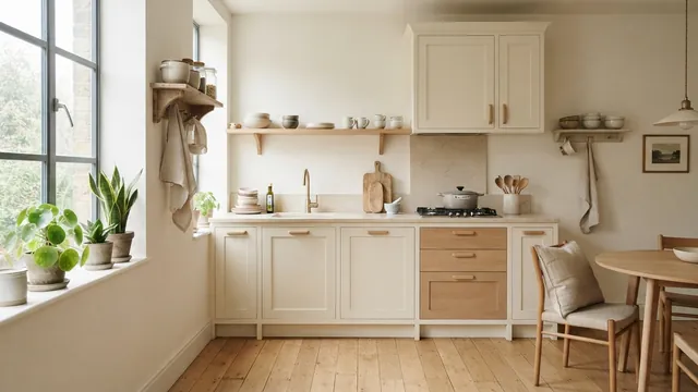
Small Kitchen Design — Light, Space and Smart Storage
Use light, smart storage, and slim furnishings to make a small kitchen feel more open.
Living Room Paint — Measurements and Buying Tips
Measure your walls, count coats, and buy the right amount of living room paint.