What Color for a Living Room? Choose a Calm, Cohesive Palette
Find living room colors that suit your light, furniture, and home.
Popular living room colors to consider
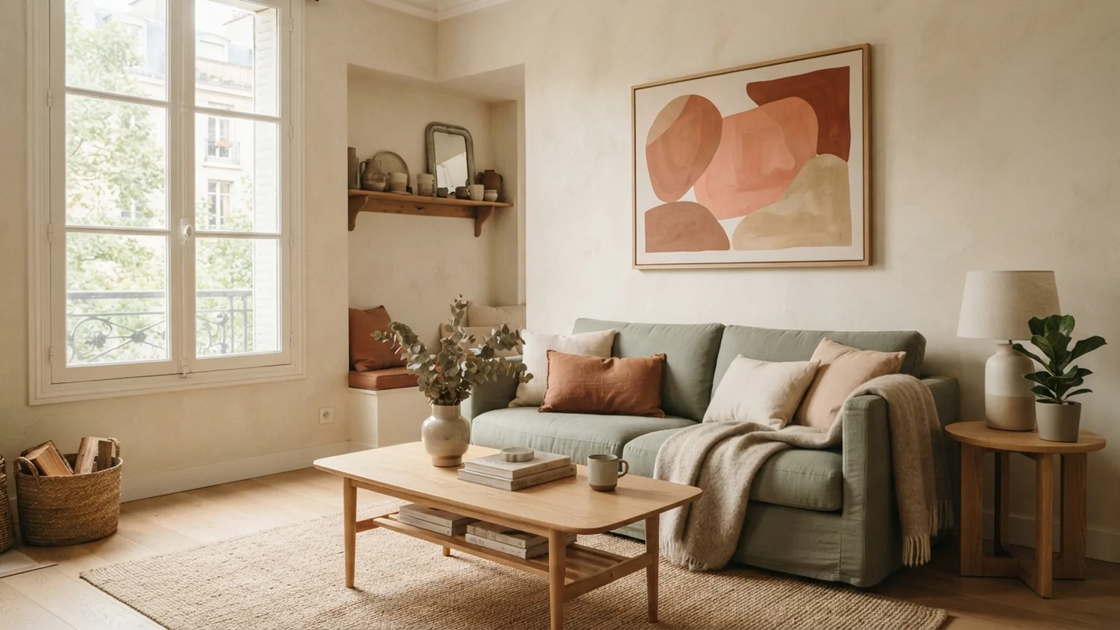
The best color for a living room depends on its light, size, furnishings, and the mood you want. Warm white, soft beige, sage green, muted blue, and earthy terracotta are flexible starting points. Pick a shade that looks good beside your main furniture, not just on a paint card.
Several shades were popular in 2023, including warm neutrals, soft greens, earthy browns, and dusty blues. These colors still suit many homes because they pair well with wood, linen, and other natural finishes. Trends can spark ideas, but your room’s light matters more than a color’s past popularity.
- Soft sage: Brings a quiet, nature-inspired feel and works with oak or cream.
- Dusty blue: Adds a calm note and pairs well with warm white or tan.
- Terracotta: Adds warmth through paint, cushions, pottery, or a small accent wall.
- Warm white: Keeps a room light without the stark feel of some cool whites.
Natural light can shift a shade throughout the day. A north-facing room may make paint look cooler, while strong afternoon sun can make it seem warmer. Check the color in the room before you decide.
How to choose a living room color scheme
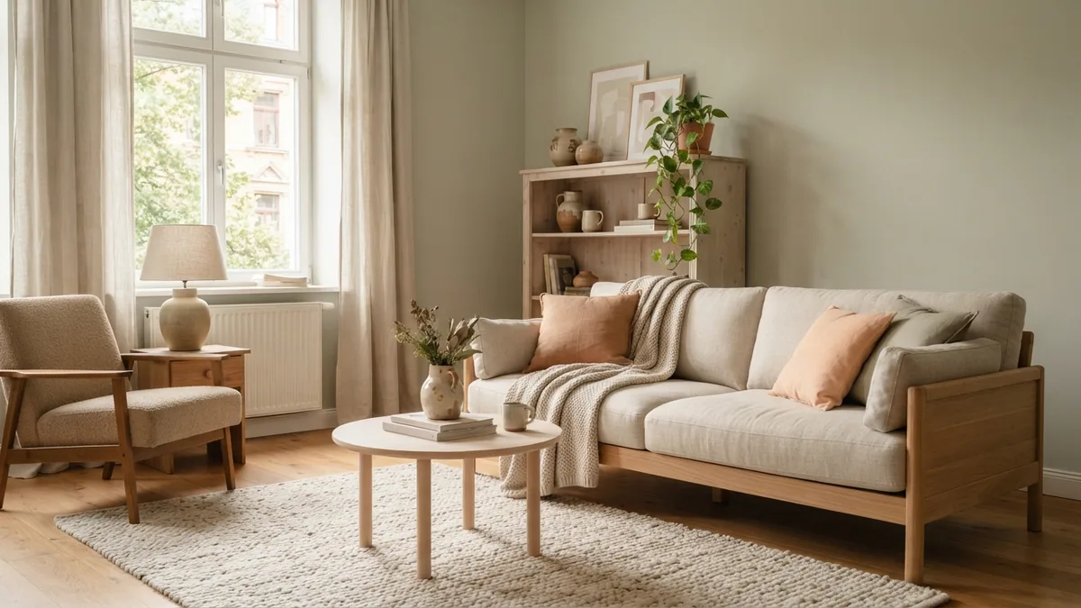
Start with a fixed feature, such as a rug, sofa, fireplace, or wood floor. Pull one main color from that item, then choose a wall shade that supports it. This is often easier than picking paint first and trying to match everything later.
A simple scheme uses three parts: a main color, a supporting color, and a small accent. For example, pair warm white walls with a sage sofa and terracotta cushions. Or use pale beige walls, a muted blue rug, and dark green plants.
Color pairs can also guide your choices. Blue and warm tan balance each other, while sage and blush feel soft and fresh. Terracotta looks at home beside cream, olive, or muted blue. If you want a bolder look, use one strong color in small amounts.
To work out how to color coordinate a room, repeat each shade at least twice. A cushion, vase, or lamp can echo a wall or rug color. Repeating tones helps the room feel joined up without making every item match.
- Choose one fixed item to guide the palette.
- Pick a wall color that suits the item and the room’s light.
- Add one supporting shade through fabric or furniture.
- Use a small accent color in a few well-spaced spots.
Coordinate the living room with nearby spaces
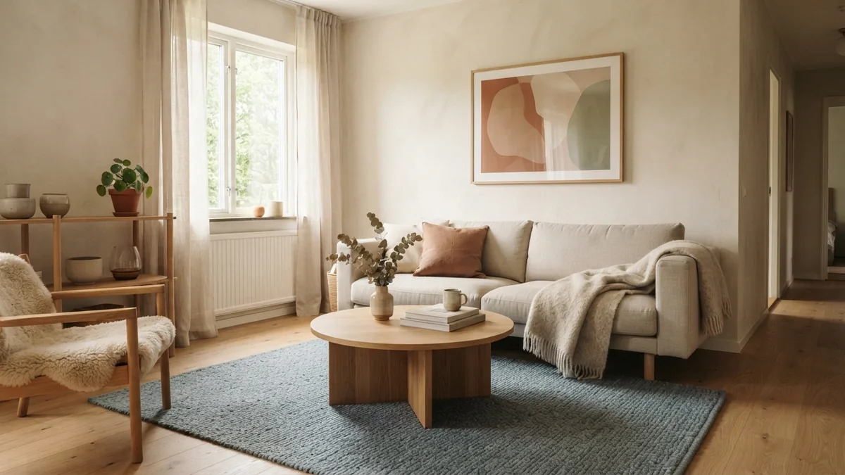
Rooms that connect through a doorway do not need the same wall color. They do need a clear link. Repeat a shared trim color, wood tone, or accent shade to make the change feel planned.
If your hallway is narrow or dim, a light wall color can help it feel open. Use a related shade in the living room, such as warm white in the hall and pale beige in the sitting area. So, should the hallway be the same color as the living room? It can be, but a close match often gives both spaces more character.
For a kitchen beside the living room, look at cabinets, counters, and flooring before choosing paint. A red kitchen can sit well beside a living room in warm white, soft beige, or muted green. Avoid adding several new strong colors at once. Let one room carry the bold shade, then echo it with a small accent nearby.
Stand in each space and look through the doorway. Check whether the colors sit well together in daylight and after dark. This view often reveals clashes that are hard to spot when you inspect each room alone.
How color can shape the room’s mood
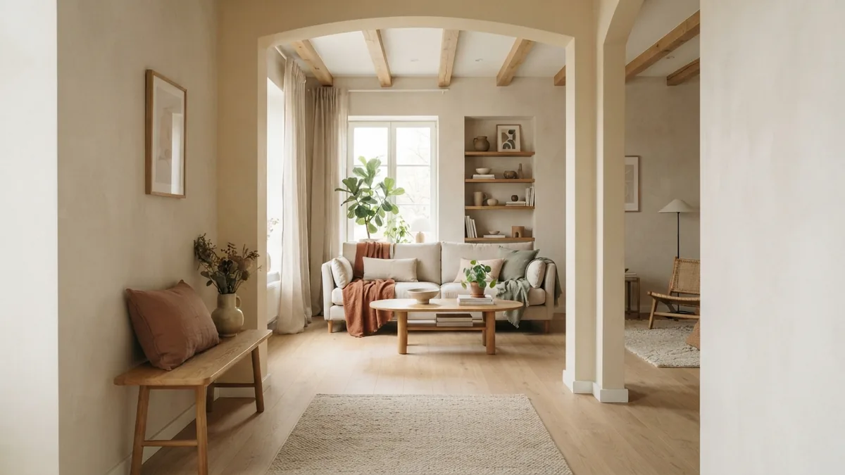
Color psychology offers useful clues, though personal taste and lighting still matter. Blue often feels calm and restful, so it can suit a room used for reading or quiet evenings. Yellow can feel lively and bright, but a strong yellow may feel too sharp across every wall.
Green often brings a relaxed, natural feel. Warm reds and terracotta can add energy and comfort, especially as accents. Pale neutrals tend to feel open and easy, while deep shades can make a large room feel snug.
Think about what you do in the room before you choose. A family space may need a warm, forgiving shade that works with daily use. A room used mainly for quiet time may suit softer greens, blues, or warm whites.
Try the color with your usual lamps on as well as in daylight. Bulbs can make a shade look more yellow, pink, or cool. The right choice should feel good at the times you use the room most.
Neutral colors that work well in living rooms
A good neutral color for a living room could be warm white, greige, light taupe, or soft beige. These shades work with many furniture styles and make it easier to change cushions or art later. They also help a small room feel brighter when the space gets enough natural light.
Neutrals are not all the same. Warm shades have hints of yellow, red, or brown, while cool shades can lean blue or grey. Compare the paint with your floor and furniture. A cool grey may look flat beside honey-toned wood, while a warm greige may bring the pieces together.
For a calm neutral palette, layer different textures and tones. Pair cream walls with oat-colored linen, pale oak, and a darker brown rug. This adds depth without needing a bright wall color.
Also think about how much upkeep the room needs. Pale walls can show marks more clearly in a busy home. A mid-tone neutral may hide everyday wear better and still feel light.
Test wall paint before you commit
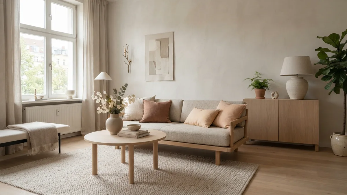
Paint samples are worth the small cost and effort. A color chip is too small to show how a shade will look across a full wall. Test at least two or three options in the room itself.
Paint large sample boards, or use sample patches on more than one wall. Move a board around to compare bright spots, shaded corners, and areas near furniture. Let the paint dry fully before judging it.
- Check the sample in morning, midday, and evening light.
- Look at it beside floors, curtains, and large furniture.
- View it with lamps on, using the bulbs you normally use.
- Live with the samples for a few days before choosing.
When deciding what color for a living room wall, judge the whole room rather than one patch. Ask whether the shade works with nearby spaces and the items you plan to keep. If it looks right in changing light, you have a strong choice.
Frequently asked questions
- What color should a living room be?
- Choose a color that suits the room’s natural light, furniture, and mood. Warm white, beige, sage, and muted blue are useful starting points.
- What is a good neutral color for a living room?
- Warm white, soft beige, greige, and light taupe work well in many living rooms. Check each shade beside your floor and furniture.
- Should the hallway be the same color as the living room?
- No, but a shared trim color or related wall shade can link the spaces. A lighter hallway shade may help a narrow area feel open.
- What colors go well with a red kitchen?
- Warm white and soft beige can balance a red kitchen. Muted green may also work, especially when other room finishes are simple.
- How do I test living room paint colors?
- Paint large samples or use sample boards, then check them at different times of day. Compare them with your flooring, furniture, and lamps.
Related reading
How to Choose Colors for a Room — Build a Calm, Cohesive Home
Build a room palette that feels balanced in your home’s own light.
How to Paint a Room Step by Step
Prep well, paint in the right order, and get a smooth room finish.
How Much Do Interior Decorators Get Paid? Salary by Location
Decorator pay depends on location, experience, specialty, and how you work.