Room Color Choices — Build a Calm, Cohesive Home
Build a room palette that feels balanced in your home’s own light.
Start with the basics of color theory
To choose colors for a room, start with its use, natural light, and the finishes you already own. Then pick a main color, add a supporting shade, and use one or two accents. This simple plan helps rooms feel connected without making every wall the same color.
A color wheel shows how hues relate. Red, yellow, and blue are often taught as the primary colors in traditional paint theory. Mixing two primaries creates secondary colors: orange, green, and violet. Tertiary colors sit between them, such as blue-green or red-orange.
Color harmonies offer a useful way to pair shades. Analogous colors sit beside each other on the wheel, such as blue, blue-green, and green. They tend to feel calm together. Complementary colors sit opposite each other, such as blue and orange. Use them in measured doses for stronger contrast.
These rules are a starting point, not a formula. Paint, fabric, wood, and stone can shift how a shade reads. Compare real materials in the room before settling on a scheme.
- Primary: red, yellow, and blue in traditional paint theory
- Secondary: orange, green, and violet
- Tertiary: blends between a primary and a nearby secondary shade
Think in layers, not isolated colors.
Match color to the room’s mood
Color can affect how a space feels, though the effect varies by person and context. Soft greens and muted blues often feel restful. Warm whites, oat, and beige can make a room feel gentle and open. Terracotta, rust, and warm peach bring more energy and warmth.
Choose hues with the room’s job in mind. A bedroom may suit quiet, low-contrast shades. A dining area can handle richer color or a warm accent. In a home office, a soft green or muted blue may feel focused without becoming stark.
Light changes color throughout the day. North-facing rooms often get cooler, less direct light, so warm paint can help balance the feel. South-facing rooms tend to receive stronger, warmer light. East-facing rooms are brighter in the morning, while west-facing rooms gain warmer light later.
Artificial bulbs matter too. A warm bulb can make pale paint look creamier, while a cool bulb can bring out blue or green notes. Check the room in daylight and after dark. The same swatch can look like two different colors.
Notice how the shade feels at different times.
Build a palette that works across your home
When choosing colors for home interior spaces, begin with fixed features. Note the floor, counters, tile, large furniture, and wood trim. These are costly to change, so the wall color should work with them rather than fight them.
Next, choose a simple palette for each room. Select a dominant color for walls or large surfaces, a supporting color for furniture or textiles, and an accent for small details. A rough 60-30-10 split can help: about 60 percent main color, 30 percent secondary color, and 10 percent accent. Treat it as a guide, not a strict rule.
Repeat a few shades from room to room to create flow. For example, warm white walls, pale oak, and soft sage can link a living room to a hall. Change the accent in each space to keep the home from feeling copied. Decor style matters too. Natural linen and pale wood suit a calm, pared-back palette, while patterned fabrics may call for quieter walls.
For a living room, try one of these combinations:
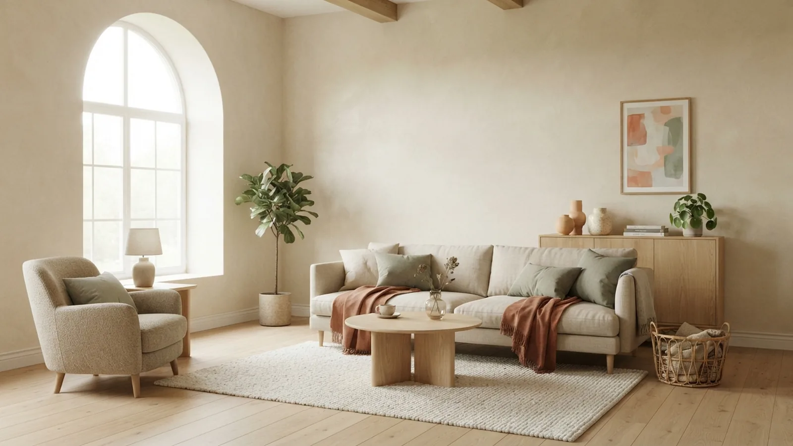
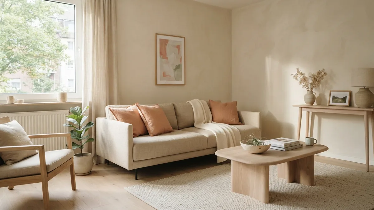
- Warm neutral: cream walls, beige upholstery, pale oak, and muted terracotta details
- Soft coastal: off-white walls, sand tones, pale wood, and restrained blue-green accents
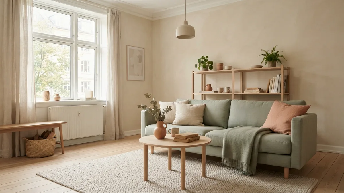
- Gentle botanical: warm white, light sage, natural linen, and leafy green touches
- Earthy contrast: soft beige, warm brown wood, and a small amount of rust or deep green
Keep the palette tied to materials you already like.
Use living room accents with purpose
Accent colors work best when they have a clear role. They can draw attention to a feature, add warmth, or bring life to a neutral room. For a calm scheme, choose one accent hue and repeat it in three places, such as a cushion, a ceramic vase, and artwork.
To choose accent colors for a living room, look at the largest items first. A rug, sofa, or piece of art can offer colors to borrow. Pick a shade that already appears in one of those pieces, then use it in smaller amounts. This makes the accent feel linked to the room rather than added at random.
Use contrast with care. A terracotta cushion can stand out against cream walls without taking over. A pale sage throw may blend more gently with beige and oak. If you choose a vivid accent, keep the other small details quieter. A room needs places for the eye to rest.
Accent color does not have to go on a wall. Try lampshades, cushions, curtains, ceramics, or a painted side table first. These are easier to change than a full wall, and they let you test the color over time.
Small touches can shift the whole room.
Color pairings that can miss the mark
Some combinations feel uneasy because their undertones clash. A warm cream wall can look yellow beside a cool grey sofa. A blue-white trim may make warm beige paint seem dull. Compare shades side by side, including your floor and fabric, before you buy paint.
Another common mistake is using too many strong colors. Three bold hues can compete for attention, especially in a small room. Keep one shade in charge, then use quieter colors to support it. If you love several bright pieces, let one lead and move the others to nearby rooms.
Do not pick a wall color from a tiny chip alone. Small samples can look different once they cover a broad surface. A color that seems soft in a shop may feel intense across four walls. Test a larger patch first.
Finally, do not copy a trend without checking the room. A fashionable dark green may look rich in a bright space but heavy in a dim one. Use trends as inspiration, then judge the color against your own light, furnishings, and taste.
Choose paint with room details in mind
When deciding how to choose colors for living room walls, start with the room’s light and fixed finishes. A pale wall can help a small or dim room feel more open, but it will not create daylight where none exists. A deeper shade can make a large room feel intimate, especially when paired with warm lighting and soft fabrics.
Check what the room faces and when you use it most. A morning room may look very different from a west-facing space used in the evening. Think about how the room connects to the hall or kitchen. A shared neutral can ease the shift between spaces, while one accent wall can mark a change in function.
Use the same method for other rooms. In a kitchen, test paint beside the cabinets and counters. In a bedroom, view it next to bedding and curtains. In a bathroom, check the shade under both daylight and its installed bulbs.
Make a short list before choosing: room purpose, fixed finishes, light direction, and the mood you want. This keeps the choice grounded. It also makes it easier to compare two or three paint options instead of dozens.
Test colors before you commit
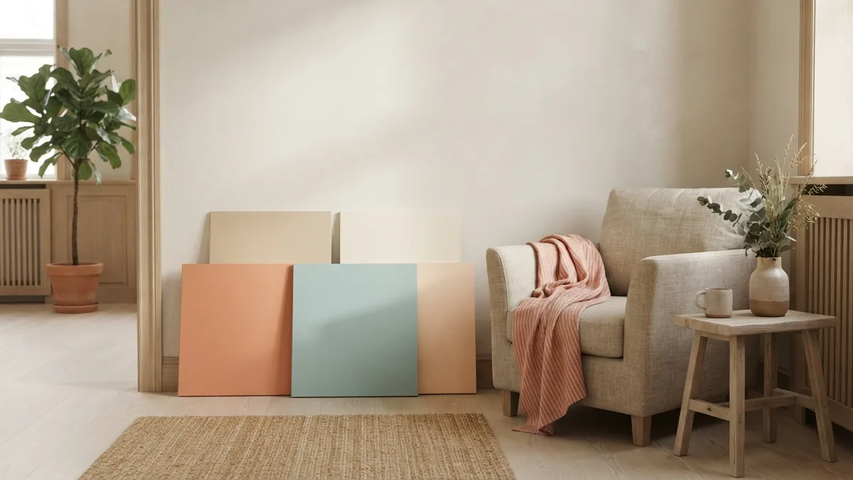
Samples help you see how a color behaves in its real setting. Paint large sample boards or use peel-and-stick swatches made for that purpose. Place them near trim, furniture, and the floor. Move them around the room rather than leaving them in one spot.
Look at each sample in morning light, afternoon light, and evening light. Check it beside the room’s main fabrics and hard finishes. If a color changes in a way you dislike, rule it out. If it still feels right at different times, it is a stronger choice.
Test the finish as well as the hue. Matte paint can soften a wall and hide small flaws, while eggshell has a little more sheen and is easier to wipe. The finish changes how light reflects, so review the sample in the finish you plan to use.
Keep notes as you compare. Write down the paint name, room, light conditions, and what sits beside each sample. Then step away for a day before deciding. A little testing can prevent a costly repaint.
- List the room’s fixed finishes and main furnishings.
- Choose a mood and a main color family.
- Build a palette with one main shade, one support shade, and an accent.
- Test large samples beside the room’s real materials.
- Review the samples at different times before buying paint.
That is a reliable way to choose colors for your home interior. Let the room guide the palette, and let samples make the final call.
Step-by-step
- 01 Review the room
Note the room’s purpose, fixed finishes, main furnishings, and light direction. Decide what mood would suit the space.
- 02 Pick a color family
Choose a main shade that works with the room’s fixed features. Add one supporting shade and a small accent.
- 03 Check the palette
Compare the colors with fabrics, flooring, and furniture. Use repeats from nearby rooms to help the home feel connected.
- 04 Test large samples
Place large samples in more than one spot. View them in daylight and after dark.
- 05 Make the final choice
Choose the shade that still feels right across changing light. Check the planned paint finish before buying enough for the room.
Frequently asked questions
- How do I choose colors for a room?
- Start with the room’s purpose, natural light, and fixed finishes. Choose a main shade, a supporting color, and one accent, then test large samples in the room.
- How many colors should a room have?
- Three main color roles are a useful starting point: one dominant shade, one supporting shade, and one accent. You can add texture and small variations without adding several competing hues.
- How do I choose accent colors for a living room?
- Borrow an accent from a rug, sofa, artwork, or other large item. Repeat it in a few small details, such as a cushion, vase, or lamp.
- What paint colors make a small room feel bigger?
- Light, low-contrast shades can help a small room feel more open. Test them in the room first, since daylight and nearby finishes change how pale colors look.
- How should I test paint colors before buying?
- Use large sample boards or suitable peel-and-stick swatches. View them near trim and furniture in morning, afternoon, and evening light.
Related reading
Home Interior Products — Where to Shop and What to Choose
Compare local shops and online stores to find home pieces that suit your space and budget.
Famous Interior Designers — Their Ideas and Influence
Meet influential designers and learn what shapes their work, fame, and lasting impact.
Area Rugs — Size, Layout, and Room Balance
Choose a rug that fits your room, furniture, and daily routines.