Kitchen Cabinets and Wall Color — When to Match and When Not
Match for calm or contrast for drama. Use lighting and palettes to plan a harmonious kitchen.
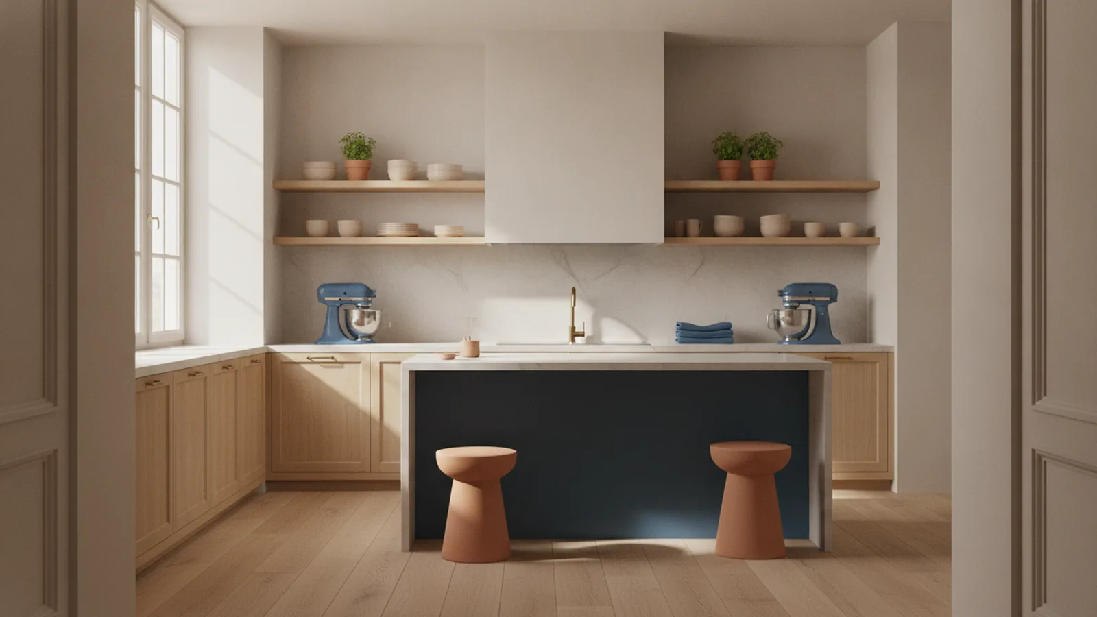
Overview of color coordination
So, should kitchen cabinets match wall color? In most kitchens, a close color match creates a calm, pulled-together look. But “matching” does not mean identical paint. It usually means using the same undertone family and similar lightness so the room reads as one design.
Color changes how big and open a kitchen feels. Light walls and lighter cabinets make the space feel taller and more breathable. Dark cabinets can look elegant, but they may make the room feel tighter if the walls stay equally dark. This is why kitchen aesthetics often come down to value contrast, not just hue.
Kitchen color coordination also affects how finishes work together. Cabinet sheen, wall paint sheen, and hardware metal can shift a color. A warm beige can look creamy with bright bulbs, then look gray under cool light. Planning with color theory helps you avoid surprises.
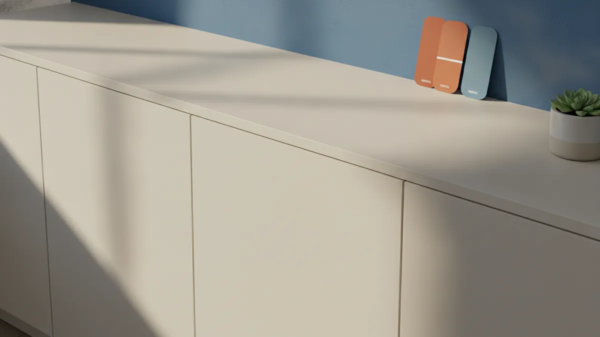
Arguments for matching cabinets and wall color
Matching cabinets and wall color helps the eye glide across the room. That visual flow can make small kitchens feel larger. It also creates a modern kitchen style when you keep the palette tight and let texture do the work. For example, matte cabinets with a soft eggshell wall finish still feel intentional.
One practical benefit is easier decision-making. When cabinets and walls share an undertone, you spend less time “fixing” one area later. Color matching also reduces the risk of clashing metals. If your cabinet hardware is warm brass, an equally warm wall undertone usually harmonizes better.
Successful pairings often follow a value rule. Match undertones, then vary value by about one step. For instance, choose light walls and slightly deeper cabinets. This keeps depth without breaking the unified look.
- Soft white cabinets + warm off-white walls for a bright, airy feel
- Greige cabinets + greige walls for a calm neutral base
- Light wood cabinets + honey-toned wall for warmth and comfort
- Charcoal cabinets + deep slate wall for a grounded look
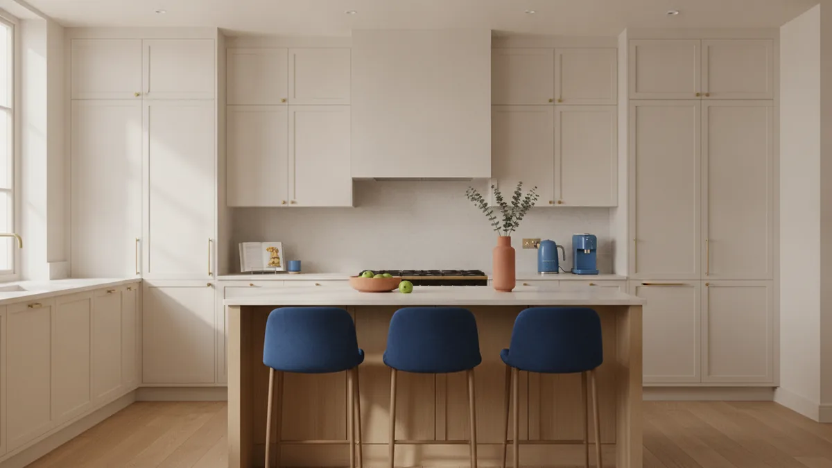
Creative contrasts: when to diverge
There are times you should not aim for a tight match. If you want kitchen design that feels more layered, contrast can add energy. Contrast also helps you define zones. The cooking area can feel distinct from dining or prep space.
A useful guideline is to contrast by one dimension at a time. You can contrast hue while keeping undertones consistent. Or you can contrast value while using similar undertones. Trying to contrast everything at once is where kitchen color coordination often goes wrong.
For example, white or cream walls with deep cabinets can look crisp and high-end. The key is undertone coordination with lighting. A cool white cabinet paired with a warm cream wall often looks “off” because the neutrals disagree.
When cabinets are dark, you may need brighter walls. Dark cabinetry can dominate, so lighter walls bring balance. If you love drama, use a darker accent wall near the cabinets instead of making every wall dark.
- Pick your cabinet undertone first (warm, cool, or neutral).
- Choose wall color with the same undertone family.
- Decide the value contrast level: subtle (near match) or bold (noticeable).
- Confirm the result under your real light bulbs.
Trends in kitchen color schemes
Current kitchen design trends favor palettes that feel natural and lived-in. Many modern kitchens use warm whites, soft taupes, and greige tones instead of stark pure whites. That shift makes spaces feel less clinical and more comfortable for daily use.
Another trend is “two-tone” kitchens. People often keep upper cabinets lighter and use deeper shades for lower cabinets. This gives height and depth at the same time. Pairing a lighter wall with one darker cabinet zone is a common way to get contrast without visual clutter.
Color accents are also trending. Hardware and fixtures in brushed nickel, matte black, or warm brass are often used with warmer neutrals. The wall color usually stays close to the cabinet undertone so the accent metals feel deliberate.
If you are following interior design trends, think about how the palette supports your modern kitchen style. Minimalist spaces look best with restrained color families. More traditional kitchens can handle warmer paints and richer cabinet colors.
Tips for choosing complementary colors
Complementary kitchen colors work best when you build from a small set. Start with your cabinets, then add wall paint, trim, and any island finishes. Aim for a palette that includes one main neutral, one supporting neutral, and one accent.
Use sample testing like a mini experiment. Paint large swatches on foam board or heavy paper. Place them in the room near cabinets and pull handles from different angles. View them at morning light, afternoon light, and evening.
Lighting plays a major role in color selection. Cabinet paint and wall paint can look different under LED, halogen, or natural daylight. Warm bulbs can make grays look beige and make blues look greener. Cool bulbs can make warm tones look slightly pink or muddy.
| Lighting situation | Common color shift | What to do |
|---|---|---|
| Warm bulbs (2700K–3000K) | Greys look warmer, whites look creamier | Test samples at night; adjust undertone |
| Cool daylight (5000K) | Beiges can look more gray | Test near windows; check midday |
| Mixed lighting | Walls and cabinets look mismatched | Pick one dominant bulb temperature |
If you want a quick “should kitchen cabinets match wall color” answer for your case, use this decision rule. Match when you want calm and continuity. Contrast when you want focus and depth. Either way, keep undertones aligned to make complementary kitchen colors feel intentional.
- Choose undertones first, then pick the hue.
- Use value planning to control how open the room feels.
- Test with lighting before you buy gallons of paint.
- Coordinate trim so edges do not create unwanted stripes.
Common mistakes to avoid
One mistake is using paint names as if they were guarantees. Two brands can share “cream” or “white,” yet the undertones may differ. Always test. Color palettes can look great on a swatch card and change in real rooms.
Another issue is ignoring cabinet finish. A matte cabinet absorbs light. A satin or semi-gloss cabinet reflects more. If your wall paint sheen differs, the same color can look different across surfaces. Consider using similar sheen levels for cabinets and walls when you aim for a matched look.
People also skip the trim and ceiling check. If trim stays bright white while cabinets and walls are warm, the room can look separated into sections. You do not need everything to match perfectly, but the trim should support the undertone direction you chose for the main surfaces.
Finally, avoid “borrowed color” problems. If your counters, flooring, or backsplash have strong veining, they can push cabinet and wall colors toward unexpected shifts. Bring those materials into your sample planning so the palette survives real conditions.
Conclusion and final thoughts
In many kitchens, the best answer to should kitchen cabinets match wall color is “often, but with intention.” A close undertone match helps the room feel cohesive and can make it feel more spacious. When you want more drama, you can diverge with value and hue contrast, as long as lighting and undertones stay aligned.
Use samples, watch them at different times, and build a small palette you can live with. That process turns kitchen color coordination from guesswork into a repeatable method. The result is a kitchen that feels designed, not decorated at the last minute.
If you are unsure, start with a calm neutral wall and select a cabinet shade that follows the same undertone family. Then adjust depth and finish. That is the fastest route to kitchen aesthetics that look right for years.
Frequently asked questions
- Should kitchen cabinets match wall color for a modern look?
- Often, yes. A close undertone match keeps the room cohesive and supports a modern kitchen style.
- What’s the safest way to choose wall color if my cabinets are dark?
- Choose a lighter wall with a matching undertone family. Test it under your evening lighting to avoid “muddy” neutrals.
- Should wall color match kitchen cabinets in a small kitchen?
- It usually helps. Similar lightness and undertones reduce visual breaks and can make the space feel bigger.
- How do I pick complementary kitchen colors without clashing?
- Start with cabinets, then select one main wall neutral and one supporting neutral. Add accents through hardware, art, or small decor pieces.
- Do kitchen cabinets and walls need to be the exact same color?
- No. Matching undertones and keeping a controlled value difference usually looks more natural than an exact match.
- How does lighting affect cabinet and wall color choices?
- Warm bulbs make some whites look creamier and can warm grays. Cool daylight can make beiges look gray, so test at multiple times.
Related reading
Best Tile Colors for a Cream Kitchen: Matching Ideas That Work
See tile colors that match a cream kitchen, with patterns, materials, and upkeep tips.
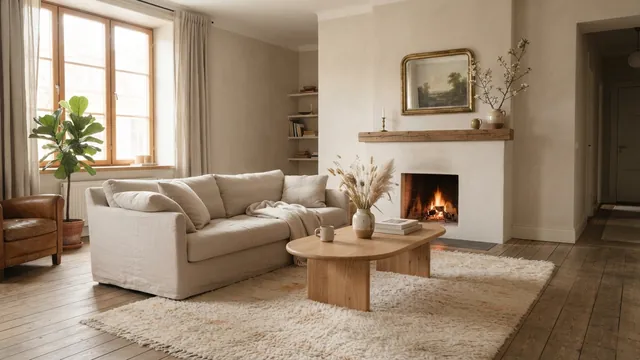
Couch Placement—Flow, Focus and Comfort
Place your couch to frame a focal point, keep paths clear, and make the room feel balanced.
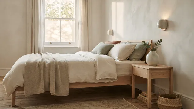
Master Bedroom — Color, Comfort and Personal Style
Build a calm, personal bedroom with smart choices and a budget that works.