Best Tile Colors for a Cream Kitchen (Ideas + Matching Tips)
Learn what colour floor tiles go with a cream kitchen. See neutral, pastel, and bold options, plus tile patterns, materials, and coordination tips.
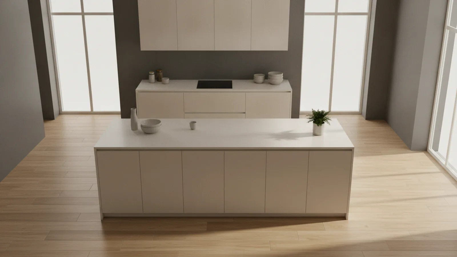
Understanding a cream kitchen
A cream kitchen is bright, soft, and forgiving. It gives you room to choose from calm neutrals, gentle pastels, or stronger contrasts. The trick is to pick a floor tile color that supports the warm look of cream kitchen cabinets without making the whole room feel flat.
Cream sits between white and beige. That means it can read cool or warm depending on the cabinet undertone. If your cream is more yellow, it likes warmer floors. If it leans gray, you can go both warm and cool with confidence.
Before you shop, check two things in your kitchen. Look at the cream in daylight. Also note how it looks under your kitchen lights at night. Tile swatches can shift in tone fast.
- Warm cream undertone: choose warm neutrals or green tones
- Cool cream undertone: choose softer grays or cooler stone looks
- Lots of natural light: you can use bolder contrast
What colour floor tiles go with a cream kitchen
If you are asking, “what colour floor tiles go with a cream kitchen,” start with easy wins. Neutral tones are the safest base. Pastels are the next easiest option. Bold tiles work best when you repeat a color element elsewhere.
Color tiles with cream kitchen work because cream has low drama. Your floor tile becomes the main style move. That means you can tune the vibe: classic, coastal, modern, or warm and rustic.
Here are practical color directions, with examples you can picture.
- Greige and warm beige: A near-match keeps the kitchen calm and high-end
- Light greys: Creates contrast without feeling harsh
- Sage green: Adds freshness while staying warm and inviting
- Soft pink: Looks playful and modern, especially in matte finishes
- Chocolate or dark brown: Gives a dramatic anchor for cream cabinets
- Terrazzo mixes: Often blend neutrals plus a hint of color
Warm colors like sage green and soft pink complement cream effectively. Sage brings a fresh garden feeling. Soft pink adds gentleness, especially with textured or matte tiles.
If you want a more daring look, choose bold contrasts. Deep charcoal or navy can look striking. Still, keep the rest of the kitchen surfaces neutral to avoid visual noise.

Popular tile materials that pair well with cream
Material matters as much as color. Two tiles with the same tone can look very different once installed. For kitchens, focus on stain resistance, slip rating, and how the tile finish shows dirt.
Wood-effect porcelain tiles are a common favourite for cream kitchens. They offer warm contrast and low maintenance. Porcelain also tends to handle spills and daily wear better than many natural options.
Natural stone tiles provide timeless appeal. Think limestone, travertine, or slate. They also bring character through veining and surface texture. The trade-off is upkeep, since stone can stain or need periodic sealing.
| Tile material | Best for | Typical look with cream | Maintenance level |
|---|---|---|---|
| Porcelain (wood-effect) | Busy kitchens and easy care | Warm, cozy contrast | Low |
| Porcelain (stone-effect) | Timeless style with fewer worries | Classic neutrals and soft drama | Low to medium |
| Natural stone | Heirloom, high-character floors | Real veining and variation | Medium |
| Ceramic | Light-duty spaces | Often warmer, simpler looks | Medium |
When people ask “what colour floor tiles with cream kitchen,” they often really mean “what color and material combination looks warm and stays easy.” That is where wood-effect porcelain shines.

Tile patterns and styles for a cream kitchen
Tile patterns shape how cream feels in the room. Straight-set tiles look clean and modern. Staggered layouts can soften the look. Herringbone and patchwork add motion and character.
Here are pattern choices that consistently flatter cream kitchen cabinets.
- Subway or metro tiles (for floors and walls): Crisp lines, great for fresh, modern kitchens
- Herringbone: Adds warmth and movement, especially in wood-effect tiles
- Patchwork: Mixes complementary tones for a curated, designer look
- Large-format tiles: Fewer grout lines for a sleek, calm surface
Patterns also help you handle color decisions. If you choose a lighter tile, a pattern can keep the floor from blending into cream. If you choose a darker tile, a pattern can prevent the floor from overpowering the room.
Kitchen design trends often lean into textured tiles right now. Texture matters with patterns. A matte or lightly textured surface can hide footprints and small debris better than a high-gloss finish.
If you like the idea of metro tiles, pair them with a grout color close to the tile tone. That keeps lines sharp. It also makes the kitchen look more refined.

Coordinating wall and floor tiles for a cohesive kitchen
Color coordination is about balance, not matching everything perfectly. Cream kitchens already provide a warm base. Your job is to create a clear relationship between wall and floor so the room feels planned.
A safe approach is to pick the floor as the “main statement” and let the wall tiles support it. For example, if your floor has warm wood-effect tones, choose simpler wall tiles in off-white or a soft neutral.
For wall tiles, metro tiles work well with most floor styles. Use them to bring structure near the sink and backsplash zones. If your floor has a busy pattern, keep the wall design calmer.
Consider this quick coordination logic.
- Pick one dominant temperature: warm, neutral, or cool
- Choose a value range: light floor with mid-tone wall, or mid-tone floor with light wall
- Repeat one undertone: green undertones, stone undertones, or wood undertones
- Keep finishes consistent: matte with matte, or satin with satin
People often search “what colour floor tiles with white gloss kitchen” too, and the same idea applies. Glossy white surfaces reflect light. That means floors can look colder. To keep it warm, choose wood-effect tiles or stone-effect tiles with gentle beige or warm gray.
One more note. If you also have a nearby bathroom, you may want a bridge between spaces. It is common to choose similar undertones in both rooms for easier flow. That also answers “what colour floor tiles with white bathroom” searches for many homeowners who want a consistent home look.

Maintenance considerations before you decide
Tiles look great in samples, but maintenance decides what you actually enjoy. In a kitchen, you need a finish that resists stains and is easy to clean. You also want a surface that does not become slippery when wet.
Porcelain usually wins for everyday care. It tends to resist stains and wear. Wood-effect porcelain can look warm and natural. It also handles routine mopping without much drama.
Natural stone tiles can be stunning. Yet stone often needs sealing to protect against stains from oils, sauces, and everyday spills. You should also think about how porous the stone is in your specific product. Ask your retailer what maintenance is needed after installation.
Use these checks before buying “tiles for cream kitchen.”
- Look for a suitable slip rating for kitchen traffic and wet entry points
- Choose grout color wisely to reduce visible marks
- Match finish to your routine matte hides more than glossy
- Ask about sealing if you pick natural stone
Finally, do not ignore scale. Large-format tiles can reduce grout lines, which cuts cleaning time. Smaller tiles and patchwork can look more decorative. Still, they usually need more attention because there are more grout joints.
When you balance color, pattern, and upkeep, matching tiles for cream kitchen becomes simple. Your floor should look right in daylight and still look good after months of real life.
Frequently asked questions
- What colour floor tiles go with a cream kitchen cabinet look best?
- Warm greige, light greys, and beige-toned tiles usually look best. They blend with cream while adding clear contrast and depth.
- What colour floor tiles with cream kitchen feel warm and modern?
- Try wood-effect porcelain in honey or light oak shades. It keeps the room cozy and stays easy to clean.
- What colour floor tiles with white gloss kitchen work without looking cold?
- Choose wood-effect or warm stone-effect tiles. Matte finishes also reduce glare from glossy white surfaces.
- Do subway or metro tile patterns work with cream kitchens?
- Yes. Subway and metro tiles bring crisp lines that pair well with cream. Keep grout close to the tile tone for a clean look.
- Are natural stone tiles a good match for a cream kitchen floor?
- They can look timeless and luxurious. Plan for sealing and extra care to protect against stains.
- How do I coordinate wall and floor tiles in a cream kitchen?
- Pick one undertone to repeat, like warm beige or soft grey. Then match finishes, and let either the floor or backsplash be the main feature.
Related reading
How to Furnish a Living Room: Layout, Budget, and Style
Layout first, then essentials, then budget-friendly style upgrades.
Best Laundry Room Colors: Light, Finishes, and DIY Ideas
Choose laundry room colors that feel fresh, stay practical, and look great in every light.
Bathroom Renovation Cost: What It Usually Costs and Why
Typical bathroom remodels cost $3k–$50k+. Here are realistic ranges and cost drivers.