Most Calming Paint Color for Bedrooms & Living Rooms
Learn which paint colors create a calming atmosphere. See calming colors for bedrooms and living rooms, plus tips for choosing by light.
Introduction to calming colors
If you want a simple answer to “what is the most calming color to paint a room,” start with soft blues. Many people find they slow their breathing and make a space feel less mentally noisy. In practice, the “calm” comes from how the color reads in the room, not from the name alone.
That said, bedrooms and living rooms often benefit from different balances of coolness and warmth. A bedroom usually needs softer contrast and gentler light bounce. A living room often needs the same calm, plus enough warmth to stay inviting.
Below, you will find the most common calming options, plus how to test them so the final shade supports rest and relaxation.
- Goal: reduce visual stress and feel more settled
- Focus: soft undertones, low contrast, and good light control
- Method: test samples in your room for a few days

Psychological effects of color (and why they matter)
Color psychology is the idea that colors can influence mood, attention, and perceived comfort. It does not mean a paint color can “fix” stress. It can shape how your brain interprets the space’s pace and safety signals.
Cool hues like blues and greens are often associated with water, sky, and distance. That association can support a calmer feeling and help people mentally downshift. Warmer hues like reds and strong oranges can feel energizing, which may work in offices but can also feel restless at night.
In real homes, the calm effect also depends on the color’s undertone. A “blue” can be gray-blue, green-blue, or violet-blue. Those undertones change how much the paint reflects light, which changes how relaxing it feels.
| Color family | Common mood cues | Where it fits best |
|---|---|---|
| Soft blues | Relaxation, lower mental load | Bedrooms and quiet living rooms |
| Sage green | Grounded calm, nature cues | Bedrooms, reading corners, living rooms |
| Warm neutrals | Gentle comfort, low visual noise | Living rooms and shared spaces |
| Muted tones | Soft focus, less distraction | Any room needing “settled” energy |
So, the practical takeaway is to prioritize soft, muted paint colors. They tend to create a calmer atmosphere because they avoid harsh contrast and loud color jumps.

Top calming colors for bedrooms
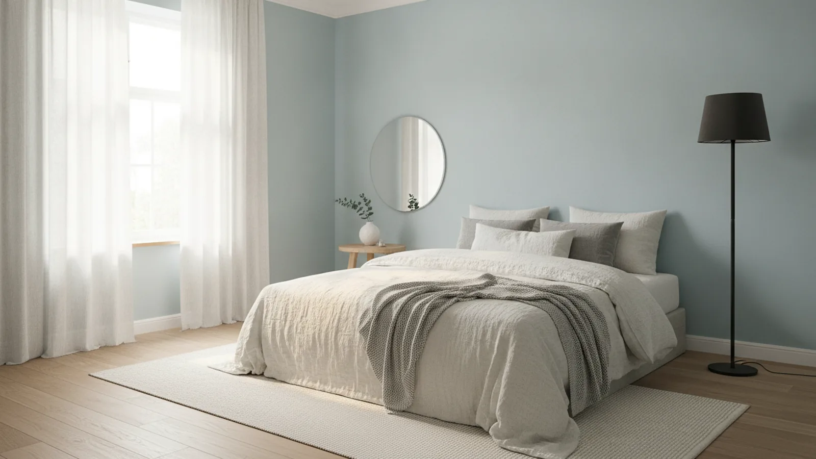
For calming colors to paint a bedroom, soft blues are usually the safest first choice. They are often linked to reduced heart rate and lower stress in general studies of blue environments. In bedroom design, they also work because they pair well with dimmer lighting and lighter bedding.
Look for soft blues that lean slightly gray or green. Those versions feel more restful than bright, saturated blues. If you choose a blue with too much purple, it can read dramatic instead of soothing.
Sage green is another strong option for a bedroom. It offers a natural, grounding feel that suits both modern and classic styles. It also stays flexible with wood tones, stone looks, and warm metals.
Warm neutrals are also excellent when you want calm without a “color statement.” Beige, ivory, and taupe can feel understated and supportive. They keep the room quiet while letting bedding, curtains, and artwork carry the visual interest.
- Pick a soft undertone, not a strong one
- Choose low-contrast paint pairings
- Match the paint to your bedding warmth
- Test the final shade at night too

Calming colors for living rooms
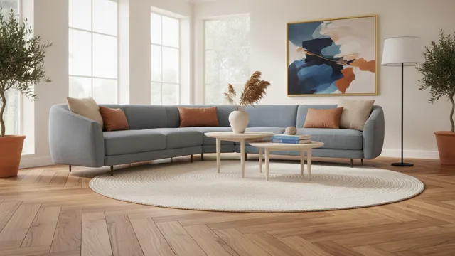
For calming colors for a living room, aim for calm that still feels welcoming during the day. A living room has more daytime activity, so overly cool or gray-forward shades can feel flat. The best results often come from muted tones with just enough warmth to stay friendly.
Sage green can work beautifully here as well. It feels connected to nature and pairs with both light and dark woods. If your living room has big windows, a sage shade can look fresh instead of chilly.
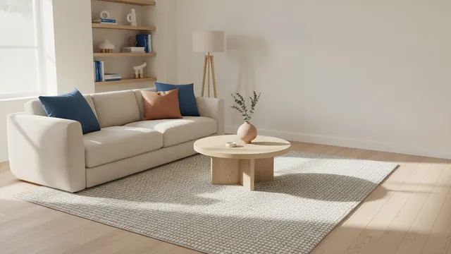
Warm neutrals are the other reliable choice. Beige, ivory, and taupe can create a soothing environment without overpowering furniture. They also help unify mixed materials like leather, fabric, and painted trim.
When selecting calming room colors for a living room, consider color rhythm. If your sofa is dark, choose a lighter wall tone to keep the room breathable. If your flooring is warm, avoid cool paint undertones that fight the floor’s warmth.
| Living room cue | Paint direction | Example result |
|---|---|---|
| Bright, sunny room | Muted cools or balanced neutrals | Calm look without feeling washed |
| Low light room | Warm neutrals or soft light blues | More brightness and less gloom |
| Warm wood floors | Greige, ivory, or earthy taupe | Less undertone conflict |
| Modern, high-contrast decor | Soft, low-saturation walls | Less visual harshness |
Soft undertones are especially important in shared spaces. They reduce perceived glare and keep the eye from bouncing around too much.
Practical tips for choosing your calming paint color
Paint color selection is where most people lose the calm they were aiming for. The same shade can look different depending on daylight, lamps, and wall reflectivity. This is why testing matters more than guessing from a color swatch.
Start by sampling in the exact conditions you live with. Place sample cards or small patches on north and south walls if your room has both. Then observe them morning, late afternoon, and evening. A color that looks relaxing at noon can feel too gray at night.
Light and space interaction is a major driver of perceived calmness. North-facing light tends to be cooler and can make soft blues feel more muted. West-facing light can warm up paint in the afternoon, which may turn a cool shade slightly greener.
- Buy two shades within the same undertone family
- Apply samples directly on the wall where the final paint will go
- Watch how the paint looks under bulbs you actually use
- Compare against your main fabric colors
Another practical step is to reduce visual competition. If you have bold furniture or busy curtains, choose a paint color with lower saturation. This keeps the room calm even when decor changes.
Natural materials can also enhance the calming effects of chosen paint colors. Wood, linen, cotton, and stone-like textures add softness through texture rather than color intensity. They also work well with sage green and warm neutrals, because the materials share earthy cues.
Finally, think about finish. Matte and eggshell finishes tend to feel softer and less reflective. That can support a relaxing look, especially in bedrooms where you want light to feel gentle.
Conclusion and recommendations
So, what is the most calming color to paint a room? Soft blues are the best starting point for many people. They commonly support relaxation and help a space feel mentally quiet. If you choose a softer, gray-blue variation, they usually stay calming without turning cold.
For calming colors to paint a bedroom, combine soft blues, sage green, or warm neutrals. Each option can create a calming atmosphere when the undertone matches your lighting and decor. Sage green adds grounded comfort, while warm neutrals deliver calm without strong visual cues.
For calming colors for a living room, choose muted tones with enough warmth to stay welcoming. Test samples in both daylight and evening light. Then add natural textures to amplify the calm rather than replacing it.
If you want a quick decision path, use this order. Start with soft blues or sage green, then test two close variations. If you still feel stuck, lean into warm neutrals and let your furnishings bring the personality.
Frequently asked questions
- What is the most calming color to paint a room?
- Soft blues are often the best first pick. Choose muted, not saturated, shades for the calmest feel.
- What are calming colors for a bedroom?
- Soft blues, sage green, and warm neutrals are common bedroom winners. Use soft undertones and test them at night.
- What are calming colors for a living room?
- Muted sage green and warm neutrals work well for living rooms. Keep undertones aligned with your flooring and lighting.
- What calming colors to paint a bedroom feel relaxing but not cold?
- Pick blue shades with a slight gray or green balance. Warm neutrals like ivory and taupe also keep the room soothing.
- How do I choose a calming paint color for my room’s light?
- Sample directly on the wall and observe in morning and evening. Same shade can shift noticeably with daylight direction and bulbs.
- Do natural materials make paint colors feel more calming?
- Yes. Wood, linen, and stone-like textures add softness and reduce harsh contrast. They pair especially well with sage green and warm neutrals.
Related reading
Best Flooring for Small Bathrooms, Laundry Rooms, and More
Pick durable, easy-to-maintain flooring for bathrooms, laundry, wet rooms, seasons, and workout spaces.
How to Start Decorating a Room: Clear Steps for Real Results
Follow simple steps to start decorating any room with style and a budget.
How to Decorate a Hutch in the Living Room: Practical Ideas
Smart, practical living room hutch decor ideas, plus seasonal tips and easy maintenance steps.