Best Room Colors: Bedroom, Kitchen, Bathroom & More
Get room-by-room color picks using lighting, comfort, and color psychology.
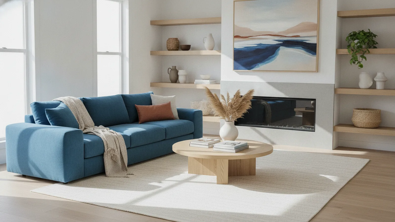
Introduction to Bedroom Color Selection
Picking paint is the fastest way to change how a room feels. In a bedroom, the goal is usually calm and comfort. That is why many people ask, what is the best color for a bedroom. The answer often starts with soft, cool tones or warm neutrals that stay relaxing.
Bedroom colors affect how easy it is to unwind at night. They also shape your focus in the morning. This is where color psychology in bedroom design becomes practical. A good palette supports your routines, not just your style.
This guide also helps you expand beyond the bedroom. You will see what is the best color for a kitchen, a bathroom, and shared spaces too. You will learn a repeatable paint color selection method you can use room by room.
Understanding Color Psychology
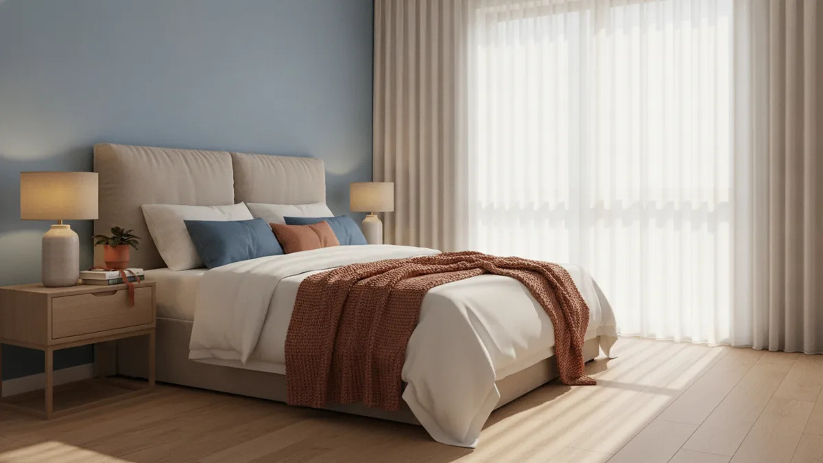
Color psychology in bedroom design looks at how hues influence mood. Cool tones like soft blues and gentle greens are often linked with calmness. They remind the eye of sky and water, which supports rest. That is why they fit well into serene bedroom environments.
Warm neutrals usually promote comfort. They include creamy off-white, light greige, and sand tones. These shades feel steady, especially when your space has wood furniture or soft textiles. In many homes, warm neutrals also stay flexible across interior design principles.
Bright or saturated shades can add energy. They can work in a bedroom that is also a work area. But overusing bold colors can reduce relaxation. At night, your brain may stay more alert than you want.
Color temperature matters just as much as hue. Cool paint can look crisp under daylight, and warm paint can look richer under warm bulbs. This is light and color at work. So the same color can feel different across rooms.
- Cool tones often feel calmer and more settled.
- Warm neutrals usually feel cozier and more forgiving.
- Bold colors can energize, but may disrupt wind-down time.
- Color temperature changes how paint reads in your light.
Best Colors for a Calming Atmosphere
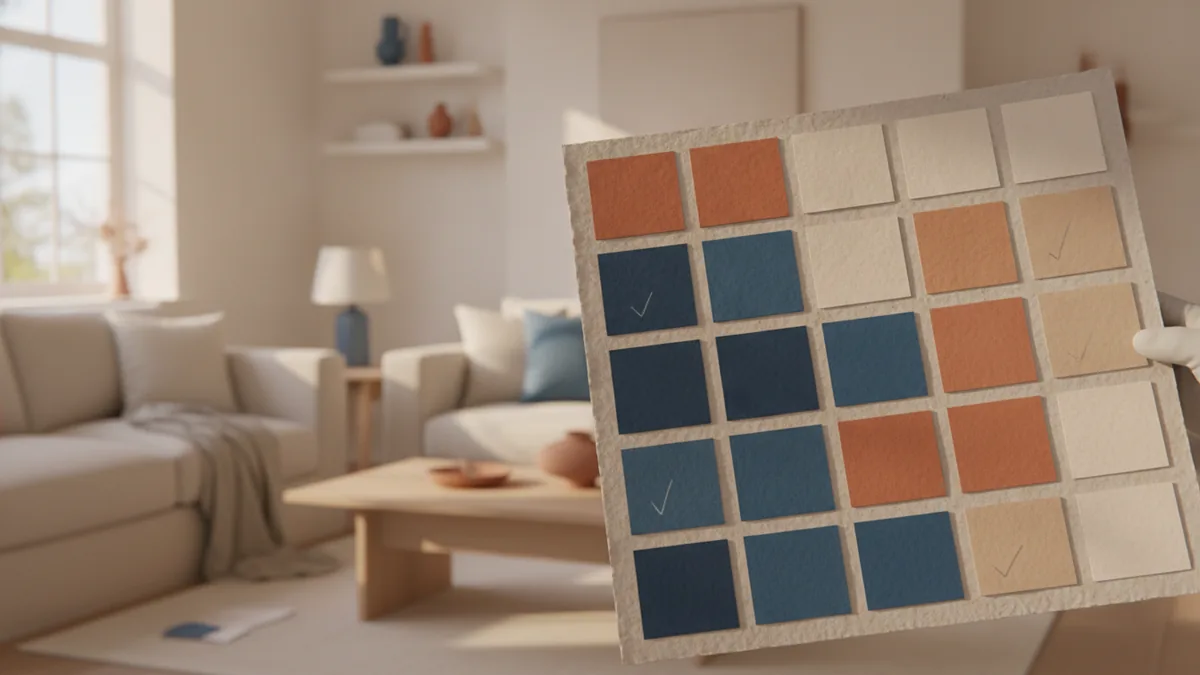
If you want tranquility, start with calming bedroom paint colors that stay light and balanced. Soft blue and sage green are common top picks. They tend to make a room feel less visually tight. That can help even smaller bedrooms feel open.
Calm neutrals are also strong choices. Try off-white with warm undertones or light greige that leans gentle. These shades keep walls bright without the harsh look of sharp white. They also hide small imperfections better, which makes touch-ups less stressful.
When you choose a “white wall,” treat undertone as the deciding factor. A creamy white usually reflects light softly. A cool white can feel sharper and may make warm wood look dull. Your wall undertone should match your flooring and bedding.
Use this quick reference map to narrow options. It is not a strict rule, but it helps you compare shades fast. You can then test each option in your room’s real light.
| Color family | Typical mood effect | Best use in a bedroom |
|---|---|---|
| Soft blue | Quiet, steady | Main walls or bedroom corners |
| Muted green | Restorative, natural | Accent wall or full room in bright areas |
| Warm off-white | Comfort and ease | Most walls with wood and warm decor |
| Light greige | Balanced, grounded | Bedrooms with mixed metals or neutral bedding |
| Soft warm gray | Calm backdrop | Rooms with consistent daylight |
Colors to Encourage Energy and Warmth
Not every bedroom is only for sleep. Some rooms need morning momentum or evening focus. In those cases, you still can keep comfort, but you choose energetic colors for bedrooms more carefully. The goal is controlled warmth, not chaos.
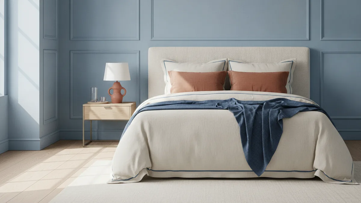
Warm neutrals are your safest starting point. Think oatmeal, sand, and light taupe. These colors feel friendly while staying easy to decorate. They also work with many bedroom design styles, from modern to classic.
Earth tones add warmth without feeling neon. Clay, terracotta accents, and soft olive can bring life to a bedroom. Use them as accents first, like on a headboard wall section, trim, or textiles. This keeps the room breathable and prevents visual overstimulation.
If you love a richer wall color, go one or two steps lighter than you expect. Dark shades can look elegant in daylight. They can feel heavy at night when your bulbs turn warm. A calmer nighttime feel usually means a softer shade level.
- Use warm neutrals on most walls for steady comfort.
- Add warmth with one accent wall or with larger textiles.
- Choose deeper tones only in bright rooms with strong daylight.
- Balance warmth with softer lighting for a smooth bedtime feel.
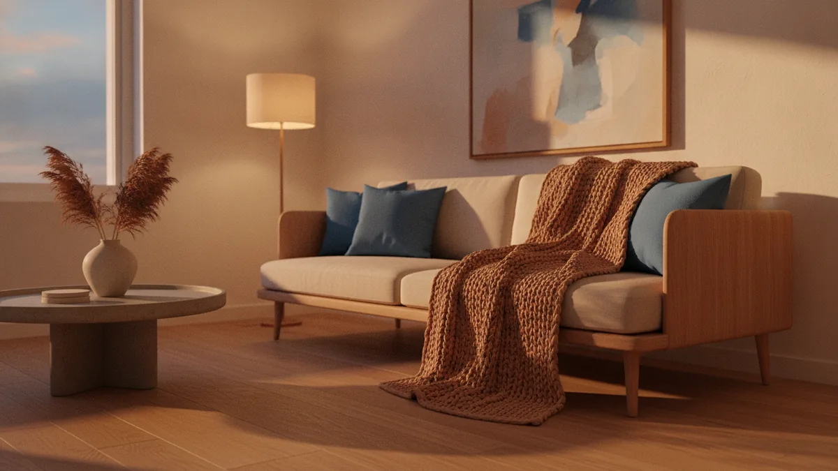
Identifying the Right Shade for Your Room
The question what is the best color for a bedroom often sounds like a simple hue choice. It is not. Shade depth and undertone drive the final look. Two paints that both say “blue” can read very differently on your walls.
First, match the undertone to your existing finishes. Look at your flooring, trim, and bedding. If your room has warm wood, a neutral that leans warm will feel natural. If your room is cooler, a gray with a blue undertone can blend better.
Next, consider the room’s purpose. A bedroom for sleep benefits from calmer tones. A bedroom that supports reading or planning can handle slightly more warmth. You can also use lighting to steer mood after sunset.
Do not buy final gallons until you test. Paint color selection should include swatches and real observation. Put swatches on the wall, then view them in morning light and evening light. This is how light and color show their true behavior.
- Pick 2 to 3 candidates from your best mood direction.
- Test swatches on the wall near your main furniture.
- Check how each swatch looks in daylight and at night.
- Choose the color that stays calm without looking dull.
Practical Tips for Choosing Colors Across Rooms
You can use the same method for other spaces. The key is choosing what each room should help you do. For example, a kitchen and a workout room both need energy, but in different ways. A dining room often benefits from a warmer, social feel. Your lighting and finish materials still guide every decision.
For kitchens, many people ask what is the best color for a kitchen. In most homes, soft warm whites, light warm grays, and muted greiges work well. These shades keep the space bright and pair with most countertops. If you want a bolder look, use contrast in one zone, like an island or a single wall.
Cabinets shape the whole kitchen more than paint alone. That is why people search what is the best color for kitchen cabinets and what is the best color to paint kitchen cabinets. Light cabinet colors can make a kitchen feel larger. Dark cabinet colors can feel modern and grounded when the room has good lighting.
Wall color and cabinet color should support each other. When you ask what is the best color for kitchen walls, start by looking at your cabinets and your lighting. Then pick a wall shade that either softly blends or clearly contrasts. For a cohesive look, stay within the same undertone family.
Kitchen appliances also affect the final read. If your appliances are stainless, cool undertones can feel clean. But you can still choose warm wall colors if you keep undertones consistent. Many homeowners find that balanced neutrals reduce glare and keep finishes working together. So the question what is the best color for kitchen appliances is often really about how your wall and cabinet tones react to that metal finish.
For bathrooms, what is the best color for a bathroom depends on how much natural light you get. Soft whites, pale warm grays, and gentle greige can make small bathrooms feel fresh. If your bathroom has darker tiles or strong shadows, lighter walls usually help you avoid a cramped feel. For the question what is the best color to paint a bathroom, most people land on light, clean tones that feel airy.
Bathrooms also need durable, easy-to-maintain paint choices. When you ask what is the best color to paint a bathroom, think about humidity and how often you clean. Color choice still matters, but contrast and scuff visibility matter too. Light walls tend to show less dust, and they keep the room bright. That supports a calmer daily routine.
Floor color changes the wall needs. If you are wondering what is the best color for a bathroom floor, pick a floor shade that fits your tile style and your countertop tones. Then choose wall paint that complements rather than fights. A common pairing is warm wall neutrals with floors that are either warm stone tones or soft cool grays.
For living rooms, the question what is the best color to paint a living room often lands on warm neutrals. These tones feel welcoming and let your furniture carry personality. If you want a richer look, try deeper neutrals on an accent wall. Keep the rest lighter if the room gets limited daylight.
Dining rooms usually benefit from warmer tones. People ask what is the best color for a dining room when they want a cozy, social mood. Soft warm whites, warm grays, and muted earthy colors can make meals feel inviting. Lighting during dinner then becomes part of your color psychology.
Workout rooms need energy. That does not mean neon walls. You can use energized colors for focus while keeping walls easy to maintain. Many spaces look great with clean warm neutrals and one stronger accent. If your workout room also hosts stretching or recovery, keep that zone calmer.
Finally, pay attention to textiles. The question what is the best color carpet for a bedroom often depends on wall tone and bedding. Light carpet can keep the room airy. Neutral mid-tones can hide everyday wear better. Your curtains should also match the mood direction. That is why what is the best color for bedroom curtains matters so much.
Even romantic bedrooms follow the same rules. The question what is the best color for a romantic bedroom often points to warm neutrals and soft earthy tones. Pair them with low-glare lighting for a gentle evening feel. You can add a deeper accent, but keep the base color calm.
If you want one shortcut, ask what is the best color to paint your room based on purpose and light. Bedrooms lean calm. Kitchens lean bright and practical. Bathrooms lean clean and soft. Living and dining rooms lean warm and welcoming.
| Room | Most common “safe” direction | What to balance |
|---|---|---|
| Bedroom | Soft blues, greens, or warm off-white | Evening relaxation vs daylight brightness |
| Kitchen | Muted warm whites, greige, or light gray | Appliance finish and cabinet undertone |
| Bathroom | Light warm neutrals or pale gray | Tile contrast and floor shade |
| Living room | Warm neutrals with optional depth on an accent | Furniture color balance |
| Dining room | Warm tones for a cozy social feel | Evening lighting warmth |
| Workout room | Clean neutrals with one stronger accent | Energy vs comfort for recovery |
Room Planning Tools and Color Confidence
Swatches are the best proof, but digital previews can help you narrow options. Many people search what is the best free kitchen design software or what is the best free interior design software. The right choice depends on how well it handles your room shape and lighting. Try a tool that lets you change wall color and view results quickly.
If you are going deeper into visuals, you may look for hardware that supports design work. People ask what is the best laptop for interior design and what is the best laptop for interior designers. Choose one based on your software needs, screen quality, and battery life. A good display helps you judge undertones more accurately.
Tools do not replace paint testing, but they reduce guesswork. Start with a shortlist based on mood direction. Then confirm with swatches in your real light. That combination gives you both speed and confidence.
When you feel stuck, go back to the basics. Decide what the room needs most. Then pick a color family that matches that job. Finally, test shade depth under morning and evening light.
- Use swatches for final choices, not just inspiration.
- Match undertones to floors, trim, and large textiles.
- Test in both daylight and bulb light.
- Use digital tools to compare options faster.
Conclusion: Creating Your Ideal Bedroom
The best bedroom color usually comes from calm fundamentals. Cool tones like soft blues and greens often support serenity bedroom environments. Warm neutrals promote comfort and stay versatile for many bedroom styles.
Color also depends on light and on the room’s use. A bedroom that must energize you in the morning can use more warmth. But the base should still help you relax at night. That is the balance that makes the space feel right.
Use the same logic for every other room. Choose what the room should help you do, then match hue and shade level to your lighting. Test swatches, observe them across the day, and adjust with intention. When you do that, your paint color selection stops being guesswork.
Frequently asked questions
- What is the best color for a bedroom to feel calm?
- Soft blues, muted greens, and warm off-white are common calming choices. They tend to support relaxation and a steady mood.
- What is the best color for kitchen cabinets?
- Light cabinet tones feel bright and flexible, while deeper tones feel modern. Pick a color that matches your wall undertones and kitchen lighting.
- What is the best color to paint a kitchen?
- Muted warm whites, greige, and light warm grays work well for many kitchens. They help the room feel clean and pair with most countertop and appliance finishes.
- What is the best color for a bathroom to keep it fresh?
- Light, clean neutrals like soft off-white or pale warm gray are popular. They make bathrooms feel airy and easier to maintain visually.
- What is the best color to paint a living room?
- Warm neutrals are a reliable starting point. You can add depth with one accent wall if the room gets enough light.
- What is the best color carpet for a bedroom?
- A neutral tone usually blends with both wall colors and bedding. Choose light for airiness or mid-tones to hide everyday wear.
Related reading
Large Living Room Walls — Scale, Style, and Warmth
Use scale, art, texture, shelves, and light to make a large wall feel balanced.
High Ceilings — Warmth, Scale and Style
Use color, scale and soft textures to make tall rooms feel inviting.
Long Walls — Ideas That Add Balance and Character
Make a long wall feel balanced with color, art, shelves, and warm light.