Cream Kitchen Worktops — Colour and Finish
Compare worktop colors and finishes for cream and white kitchens.
How Worktop Color Shapes a Kitchen
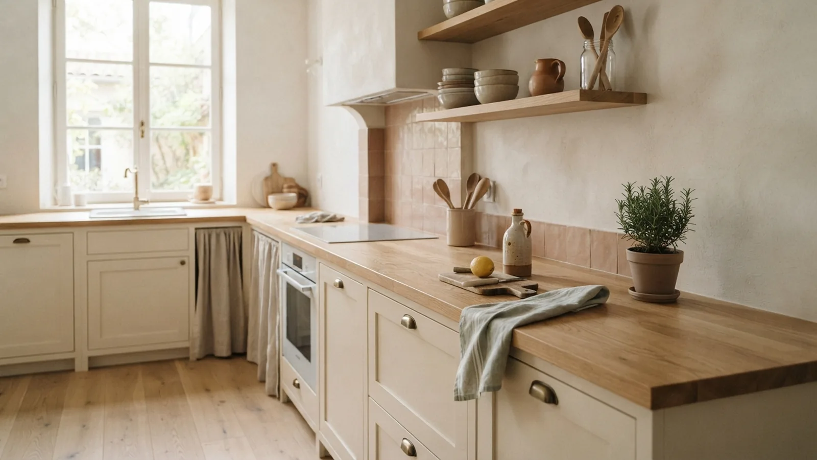
For a cream kitchen, consider warm wood, pale stone, charcoal, or navy worktops. Each creates a different look, from soft and natural to bold and modern. White kitchens offer even more scope, since both warm and cool shades can stand out against white cabinets.
Start by looking at the whole room, not just the cabinet doors. Worktops cover a large, eye-level surface and can change how warm, bright, or spacious a kitchen feels. Their finish matters too. A matte surface feels quiet, while gloss reflects light and adds shine.
Think about the floor, wall color, and any nearby dining area. A worktop that repeats one of those tones can help the room feel joined up. You can also use contrast to make an island or a run of cabinets stand out.
- Choose warm shades to bring out cream’s soft undertones.
- Use dark shades for contrast and a stronger focal point.
- Pick a finish that suits your room’s light and daily use.
Worktop Colors That Suit Cream Kitchens
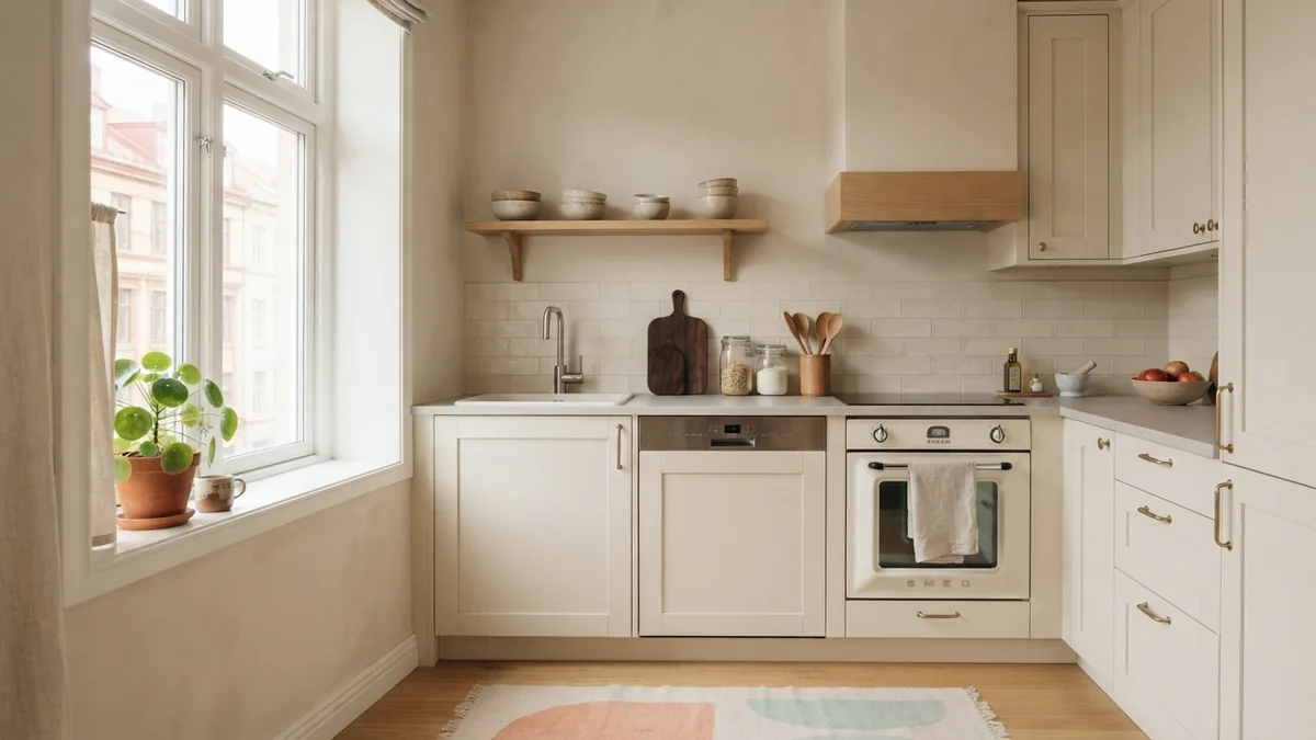
Cream cabinets pair well with many colors because they sit between white and beige. Warm wood, such as pale oak, adds grain and a natural feel. A light beige or ivory stone worktop keeps the room calm and makes small kitchens feel open.
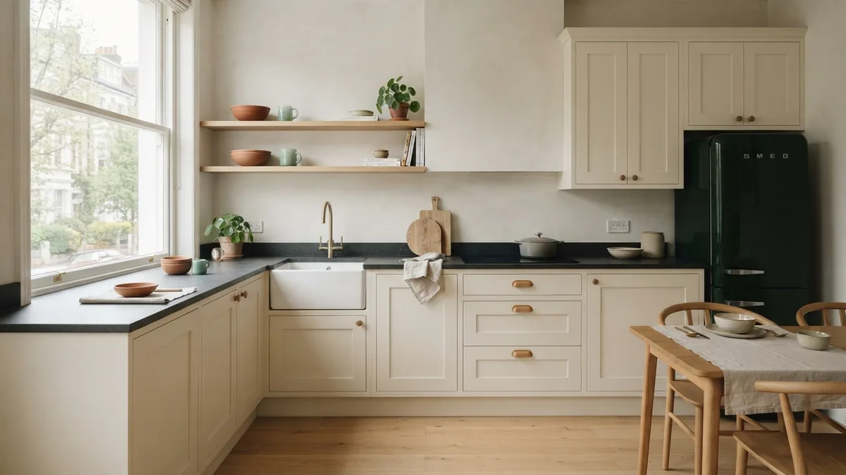
For a sharper contrast, try charcoal or deep navy. These shades give cream cabinets a clear outline and can make an island feel grounded. Use a dark worktop with care in a narrow or dim room. Pair it with light walls and good task lighting to keep the space from feeling closed in.
Light gray works when you want a cooler note without a strong contrast. Check it beside the cabinet sample first. Some gray surfaces look blue in cool daylight, while others have brown or green undertones that sit better with cream.
Wood brings warmth and texture, but its tone matters. Pale oak suits a relaxed, airy scheme. A deeper walnut shade adds weight and works well with cream cabinets, warm metal details, and a wood floor. Keep wood grains similar if several large timber surfaces share the room.
| Worktop shade | Effect with cream | Works well when |
|---|---|---|
| Pale oak | Warm, natural, and soft | You want texture without strong contrast |
| White or ivory | Bright and low contrast | The room needs a light, open feel |
| Light gray | Quiet and slightly cool | You want a gentle change in tone |
| Charcoal or navy | Bold and defined | You have enough light for contrast |
Choosing a Worktop for White and Gloss White Kitchens
A white kitchen can take warm or cool worktop colors. For a soft look, choose pale oak, cream stone, or a warm light gray. These shades stop white cabinets from feeling stark and suit natural materials such as linen, timber, and ceramic.
Dark worktops, including charcoal and navy, make white cabinets stand out. They can give a simple kitchen a more tailored look. In a small room, use dark color on one surface, such as an island, rather than across every counter.
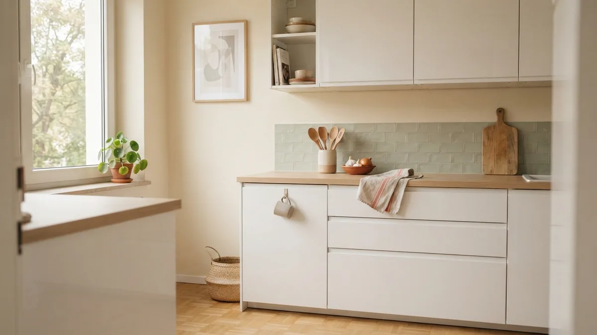
For a white gloss kitchen, consider how the worktop handles reflected light. A matte or softly textured surface balances shiny cabinet doors and helps the room feel less sleek. A gloss worktop can add a modern touch, but too many reflective surfaces may make the space feel busy.
When asking what colour worktop with white gloss kitchen cabinets, look beyond the word white. A warm white top can blend with warm-toned doors, while a cool gray or white top creates a cleaner contrast. Bring home samples and view them beside the cabinets in daylight and evening light.
Finishes and Looks to Consider
Matte finishes have a soft, understated look. They work well with cream cabinets, pale wood, and stone patterns that do not need much shine. A lightly textured finish can also hide small marks better than a smooth, dark surface.
Gloss surfaces reflect light and can make a white kitchen feel crisp and modern. They suit rooms that need more brightness, though they can show smears and glare. If your cabinets already have a gloss finish, a matte worktop adds useful contrast.
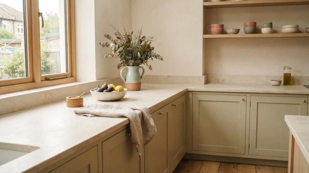
Stone-look patterns range from fine, quiet flecks to bold veins. A subtle pattern is easier to pair with busy floors or strong cabinet details. If the worktop has striking veins, keep nearby finishes simple so the surface remains the focal point.
Wood-look and natural wood finishes add visible grain. They soften white or cream cabinets and bring a sense of warmth. Ask about sealing and care before choosing real wood, especially around sinks and cooking areas.
How to Choose the Right Color for Your Room
Room size and light can change how a color reads. In a narrow kitchen, pale worktops reflect more light and help the counters feel less heavy. A large, bright room can handle deep shades across a wider area.
Check the direction and strength of your natural light. North-facing rooms can make cool grays look bluer, while warm evening light can deepen beige tones. View samples at several times of day, and compare them with your floor and cabinet doors.
Also consider the shape of the room. A long run of dark worktop can draw the eye along the cabinets. A contrasting island can break up a large space and set apart the main work area.
- Gather samples. Take home worktop, cabinet, floor, and wall samples.
- Test the light. View them in daylight and under your evening lights.
- Compare undertones. Check whether each shade looks warm, cool, or neutral beside the cabinets.
- Picture the full room. Include the floor, wall color, and large appliances in your decision.
- Check upkeep. Ask how the material handles stains, heat, scratches, and routine cleaning.
For a balanced cream kitchen, pale oak or warm stone is a safe starting point. Choose charcoal or navy when you want more contrast. For white gloss cabinets, a matte worktop can soften the shine, while a warm wood tone adds a more relaxed feel.
Make the Choice Work Day to Day
Color is only one part of a good worktop choice. Think about where you prep food, how often you cook, and which areas get the most use. A pale surface may suit a low-use breakfast bar, while a patterned mid-tone can be more forgiving on a busy family counter.
Ask suppliers for larger samples when possible. Small chips can hide pattern scale and make colors look different from full slabs. Place a sample on the counter, then view it beside the cabinet doors from across the room.
Finally, keep the palette focused. Choose one main worktop color, then use small accents through handles, stools, or cookware. That gives cream, white, or gloss white kitchens a clear look without making every surface compete.
Frequently asked questions
- What colour worktop goes with a cream kitchen?
- Pale oak, warm stone, ivory, and light gray create a soft look. Navy or charcoal adds stronger contrast.
- What worktop color suits a white gloss kitchen?
- A matte pale wood or stone worktop can soften glossy cabinets. A warm white blends in, while gray or charcoal adds contrast.
- Should a worktop be lighter or darker than kitchen cabinets?
- Either can work. Lighter tops keep a room bright, while darker tops define the cabinets and create a focal point.
- Do wood worktops suit cream kitchens?
- Yes. Wood adds warmth and grain to cream cabinets. Pale oak feels airy, while walnut gives the room more depth.
- How do I choose a worktop color for a small kitchen?
- Light shades can help a small kitchen feel open. Check samples in the room, since natural light and nearby finishes affect how each color looks.
Related reading
Bedroom Air Quality — Simple Steps for a Healthier Room
Reduce dust, manage moisture, and choose a purifier that fits your bedroom.
Interior Designers — Roles, Skills and Training
See how interior designers shape spaces, manage projects, and work with clients.
Paint Room Stripes: Planning and Technique
Plan your stripe layout, tape clean lines, and paint even coats with confidence.